
Step 1: Open the EIA_Imports_2014-18-Lab_1.xlsx file you worked with during the previous lab and rename it to EIA_Imports_2014-18-Lab_2.xlsx.
Step 2: Insert a PivotTable into a new worksheet based on the IMPORTS Sheet. Drag the sheet name after IMPORTS, after Sheet 1. Rename Sheet 1 and Sheet 2 to Lab 1 and Lab 2. (You can double-click the sheet names or you can right-click and then edit them.) Your sheet names should look like so:
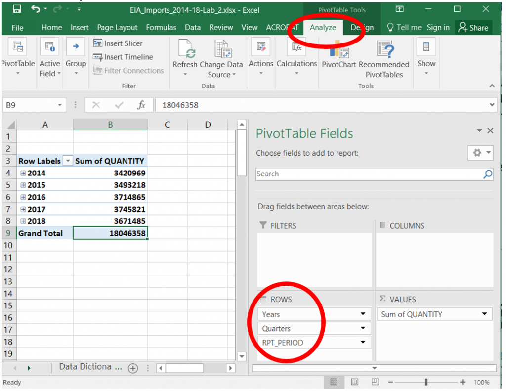
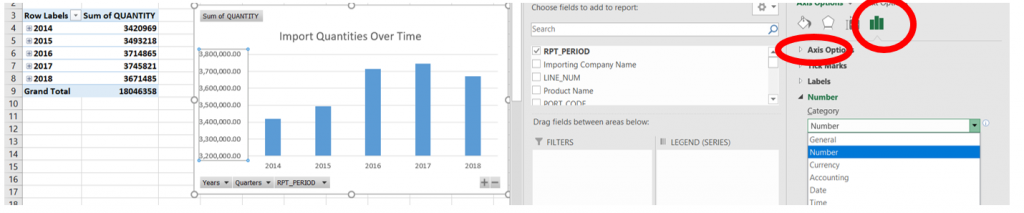
Step 3: Locate the QUANTITY field name in the list on the PivotTable Fields pane and click its checkbox. The field name will appear under Values with the SUM function applied. What does this number tell us? Essentially, it’s a simple output that shows the overall QUANTITY of products that were imported into the United States between 2014 and 2018, 18,046,358 thousand of barrels of products imported overall.
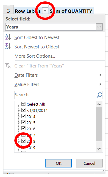
Step 4: In the PivotTable Fields, click the RPT_PERIOD field name. Excel will assign that field to ROWS. You will see the following compact PivotTable on the left summarizing dates from the very first column in our IMPORTS table by Year and Quarters. The PivotTable Fields under ROWS will show the hierarchy as well. Observe the options on the Analyze tab, locate the Show tab on the right (not visible on this screenshot below) to change visualization options with the Buttons, Field Headers options. The Field List icon will let you reveal or hide the PivotTable Fields Pane.
Self-Check
What was the overall QUANTITY of products that were imported into the US in 2015?
Answer: 3,493,218 thousands of barrels
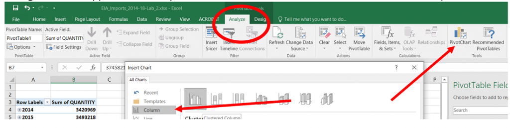
Step 5: Click into your PivotTable. From the Analyze tab, click the PivotChart icon. The Insert Chart dialogue box will appear and offer you some alternatives. Pick the Clustered Column Chart option.
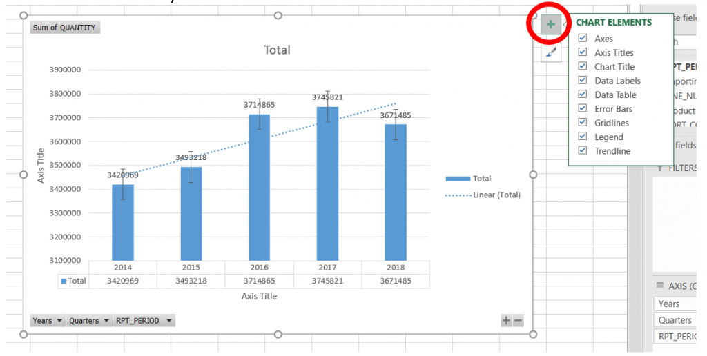
You will see the following PivotChart appear next to your small yearly summary table. Even with this simple PivotChart, it’s easier to observe the trend of imports over time than by looking at the numeric values that appear to be closer to each other at a simple glance.
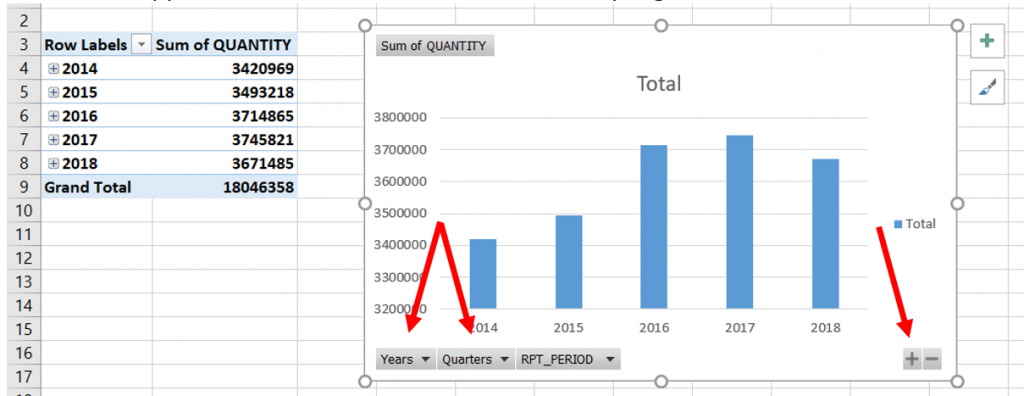
Consider how this simple Clustered Column chart is a summary of over 2 million data points. This is also a chart that you would not be able to create from the IMPORTS sheet without using a PivotChart, or a PivotTable and a PivotChart based upon it. The red arrows above point to filters that are built into your PivotChart so as to allow you to quickly rearrange your output. The dropdowns and + – allow you to change the data displayed.
Uncheck and check values to see how the PivotTable and PivotChart outputs change.
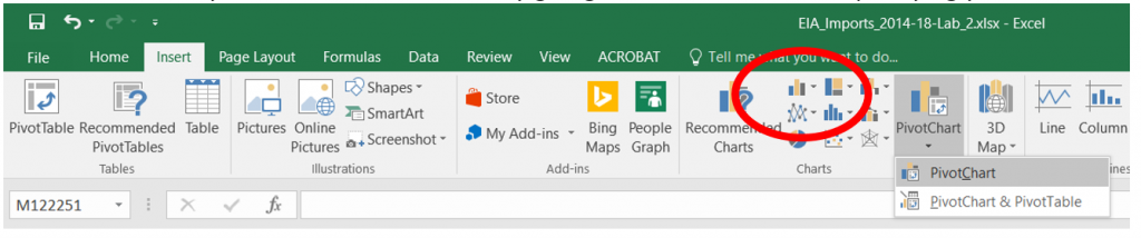
Note: Another way to insert a PivotChart is by going to the Insert tab and specifying your fields.
Step 6: Next, we will edit some of the Chart Elements to change colors, number formats, gridlines, and more. I would like for you to check all the boxes next to all of the Chart Elements.
Self-Check
- Which Chart Elements are necessary for your chart to make sense to interpret this output?
- Which Chart Elements can you remove without crippling interpretation?
- What does our textbook note about Excel’s ability to tweak settings?
- What would Edward Tufte think about this chart?
- What does Edward Tufte call necessary elements in our charts?
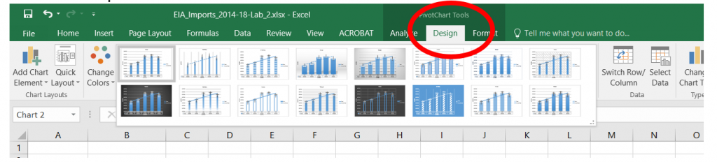
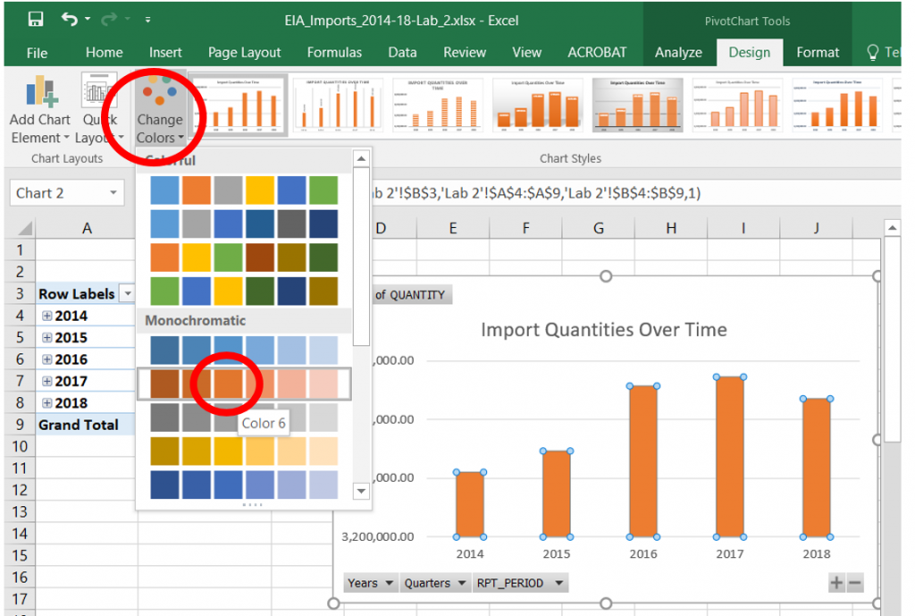
Step 7: Observe the color and layout options on the Design tab. Apply the Microsoft suggested “clicking buttons way of learning” process and change the color, layout, style options. Now, be careful, you don’t want to get lost in the hundreds of color and layout options, but consider the contrast, sizing, shading, 3-D and other options.
Self-check
- Do the aesthetics add value?
- What does our textbook suggest about all those minute settings?
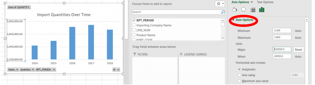
Step 8: Click into the Chart Title and change it to “Import Quantities Over Time”. Click into the numeric values in the Y axis and edit the number format.
Edit the Axis Options to show Major Units at every 200,000.
Change the colors to Monochromatic Orange Color Six.
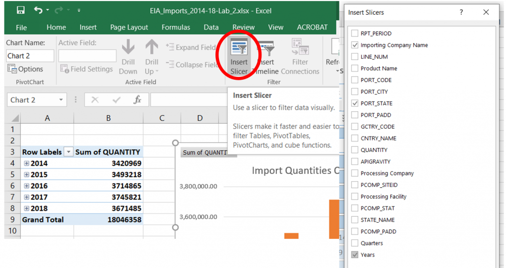
Step 9: Next, we are going to add Slicers to our sheet from the Analyze tab to filter our PivotChart to filter by Importing Company and Port State and Year.
A Slicer is an object that allows us to filter data visually. Slicers are a convenient way to change our displays and can add value to your work. For instance, you can quickly change outputs in a meeting and answer questions quickly. (We can also add a slicer from the Insert tab.)
Your sheet should look like so:
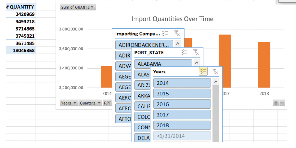
Step 10: Next, we are going to edit our slicers. On the Years slicer, right-click anywhere on a clear portion of the object. On the Slicer Settings, check the “Hide items with no data” box. Drag the bottom border of the slicer upwards so that the slicer “ends” below 2018.

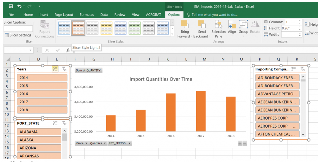
Step 11: Next, we are going to move our slicers around so that we have a better composition of our interface. Click and drag the slicers to a more visually appealing and clear configuration that also does not overlay the chart. Edit all three slicers at the same time by clicking into them while keeping the SHIFT key pressed. Under the Slicer Options contextual tab, choose Slicer Style Light 2.
Self-check
- What questions can you answer based on this configuration?
- What are your viewed about the colors used or my layout?
- What other fields would you add to this worksheet?
- Do you prefer the filtering of data using slicers or using the PivotTable field selector?
Step 12: Add a new slicer for Product Name. Match the style of the other slicers.
Exercises
Answer the following questions using your slicers.
Question: Which five states does Andeavor import crude oil into?
Answer: Alaska, California, Colorado, Minnesota, Washington
Question: Which year has Andeavor imported the highest quantity of crude oil into California?
Answer: 2018
Question: Which two companies import Jet Fuel-Kerosene Type into the state of Texas?
Answer: Vitol Inc. and World Fuel Services Inc.
