
Step 1: Open the EIA_Imports_2014-18-Lab_2.xlsx file you worked with during the previous lab and rename it to EIA_Imports_2014-18-Lab_3.xlsx.
Step 2: In this lab, we will add more visuals to our dashboard. We will try to do this in a manner so as not to overwhelm our reader/viewer yet add value overall.
Consider this: we already have a crowded dashboard and we want to add more items to it. What can we change in this setup to free up some space? We can change some of the key aspects of our existing content, including their shape, size, orientation, or even the length of text to make more room without losing any functionality.
For this step, you may also want to consider what you are making more room for. What is necessary from your data for you to create a compelling output or report? Would you want to include product names? Importing states? PADD regions? Processing Companies? World Regions? The answers are limited only by… space. That is not a bad thing though, because it makes you think about WHY you are choosing one field over another, correct?
For instance, the World region and Port State fields, or the Importing Company and Port State fields go well together if you are trying to describe movements into the US. Regional comparisons work well if you align your fields to see movements inside the US. The Processing Company Name and Processing Company State fields may show in-state activities. Are you curious about a specific year? A specific product? Trends over time for any of those variables?
Frustrated by the number of choices you have? If picking fields becomes a challenge, create a new dashboard around a specific topic and see if that does the trick! You’re limited by the space and the working memory of your computer, but there are no limits to your imagination. Yes, oftentimes, you will work on specific company reporting needs. However, you can learn a lot from serendipitous creations where you let your eyes wander and build a theme based on a general understanding of your topic.
At the end of the day, you will always have more fields than you can squeeze into a single printout or screen or slide or dashboard. Your notes about the whole process of “data to information to knowledge to wisdom” should guide your hand as you pick which fields you want to tell a story about and how that story fits your overall narrative.
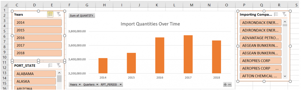
In this Lab exercise, we will build a dashboard that shows the changes in product quantities imported into US Port States from various world regions over time. We will use a variety of visuals to create a clear dashboard that will help us tell a story.
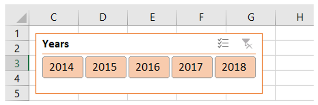
Step 3: First, we are going to resize the Years slicer so that we can save some room by changing a vertical layout into a horizontal one. Click into the Years slicer, then under Slicer Tools > Options > Columns, change from number 1 to 5, as you have 5 years. Our slicer will have to be adjusted in width so that you can see the individual filters.
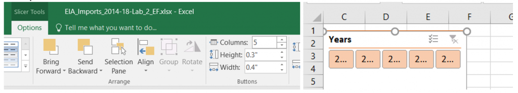
Adjust the slicer size by dragging the sides or corners until you see what looks more optimal. The resulting slicer takes up less space and breaks up the design a bit.
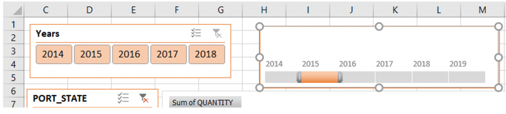
Step 4: An alternative to a slicer showing the years to filter by, you can insert a Timeline. A Timeline is a type of filter that will allow you to add an interactive filter that looks aesthetically different from a year slicer, but behaves much the same: it filters your data. To insert one, click into your PivotChart > PivotChart Tools > Analyze > Filters > Insert Timeline. Click the RPT_PERIOD field that is displayed.
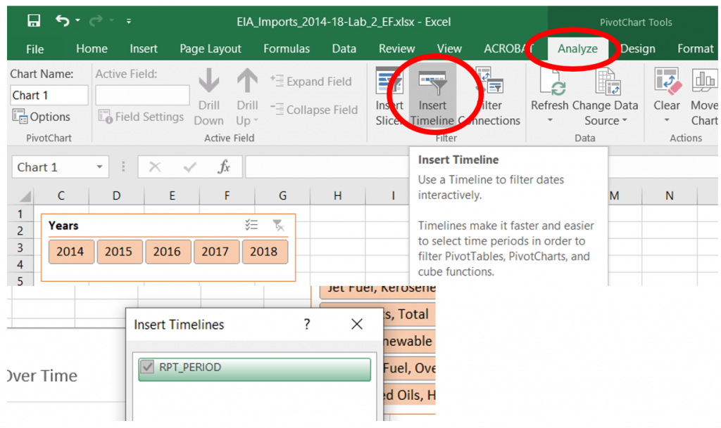
Next, change the color of your Timeline to match the overall color scheme of your dashboard. Resize or reposition as needed. It is entirely up to you wish option you choose.
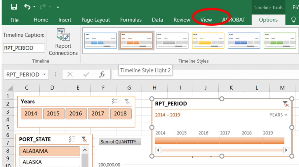
You can edit the timeline settings to Show or Hide the Header, Selection Label, Scroll bar, or the Time Level.
Which of these options do you like better? Do you prefer the original slicer from Lab 2? Pick whichever option you like the best!
Step 5: Next, we want to be able to use higher-order filters, not just state names. We are interested in the movements of Crude Oil and other products from World Regions to US Regions. In our Imports Sheet, we have state names and countries. In our US Regions and World Regions sheet, we have corresponding pieces of data. We could copy and paste and sort and fill manually to connect the two tables, but that would take hours considering how much data we have. However, we can use Excel to automate a lot of the old-fashioned manual processes so we will want to take advantage of the built-in Lookup & Reference Functions.
VLOOKUP is an Excel function that lets us automate the tedious process of returning tens or hundreds of thousands of pieces of data based on connections across columns, vertical structures.
The syntax for VLOOKUP is as follows:
=VLOOKUP(lookup_value, table_array, col_index_num, [range_lookup])
We have to specify to Excel what we are looking for in another table where in a specific column there is something we want it to return for us. In our case, we have two sheets. The IMPORTS sheet has the Country Names but no World Region listed for all of them. The World Regions sheet has both County Name and World Regions, but it’s a simple list with no connection to all the reporting periods or products or any other fields.
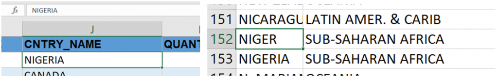
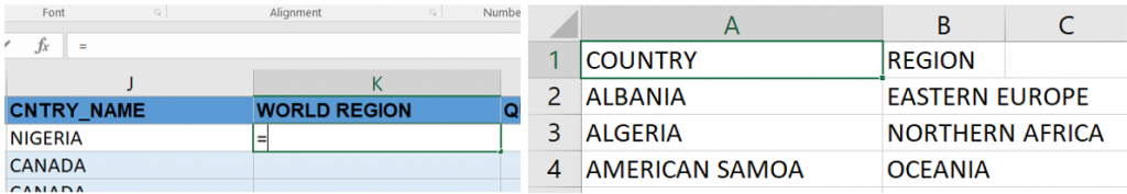
In the IMPORTS sheet, insert a blank column next to the CNTRY_NAME field. Rename this new column to WORLD REGION.
We need to use VLOOKUP to tell Excel where to get data from one table into another. The arguments for our syntax will look like this:
lookup_value: It is what we know, in this case, the CNTRY_NAME field in the IMPORTS SHEET.
table_array: It is the table where we will find BOTH the CNTRY_NAME and (WORLD) REGION fields. Use an absolute reference for this, you can cycle through the references using the F4 key.
col_index_num: The column of the table_array where we will find what we want Excel to return.
[range_lookup]: This refers to how we want Excel match our lookup_value. An EXACT match will return something based on matching our lookup_value exactly as it is, an APPROXIMATE match will return a value from a range where that value falls. Here, we have specific text, we will use EXACT match.
Our formula will be: =VLOOKUP(J2,’World Regions’!$A$2:$B$227,2,FALSE)
For additional VLOOKUP practice, please go to Chapter 3.3 of Excel for Decision Making by Felvegi et.al.
Step 6: In the IMPORTS sheet, insert a blank column next to the PORT_STATE field. Rename this new column to US REGION.
We need to use VLOOKUP to tell Excel where to get data from one table into another. The arguments for our syntax will look like this:
lookup_value: It is what we know, in this case, the PORT_STATE field in the IMPORTS SHEET.
table_array: It is the table where we will find BOTH the PORT_STATE (State Name) and US REGION fields. Use an absolute reference for this table.
col_index_num: The column of the table_array where we will find what we want Excel to return.
[range_lookup]: This refers to how we want Excel match our lookup_value. An EXACT match will return something based on matching our lookup_value exactly as it is, an APPROXIMATE match will return a value from a range where that value falls. Here, we have specific text, we will use EXACT match.
Our formula will be: =VLOOKUP(G2,’US Regions’!$A$2:$C$51,3,FALSE)
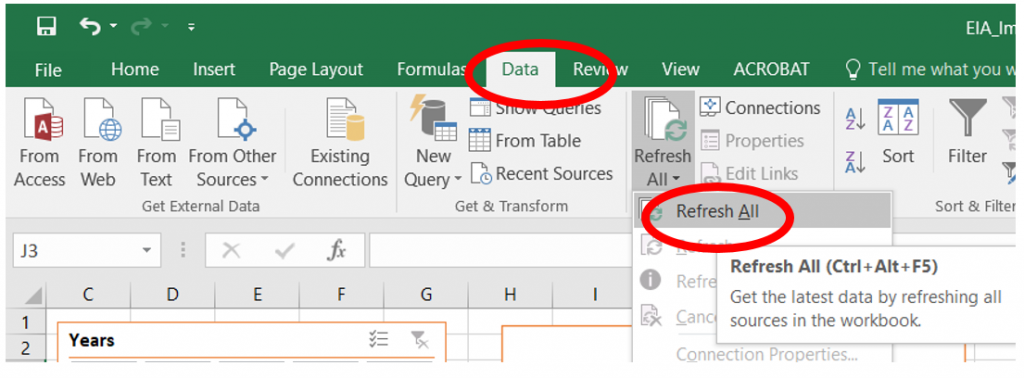
Step 7: Go to your IMPORTS sheet and insert a new PivotTable. Select WORLD REGION under ROWS and Sum of QUANTITY under VALUES. If the new fields from steps 4-5 did not populate, go to the Data tab and select Refresh All from under the Connections tab.
Adjust the value filters to show only the top 5 sources of products by clicking into the dropdown next to the Row Labels field > Value Filters > Top 10.
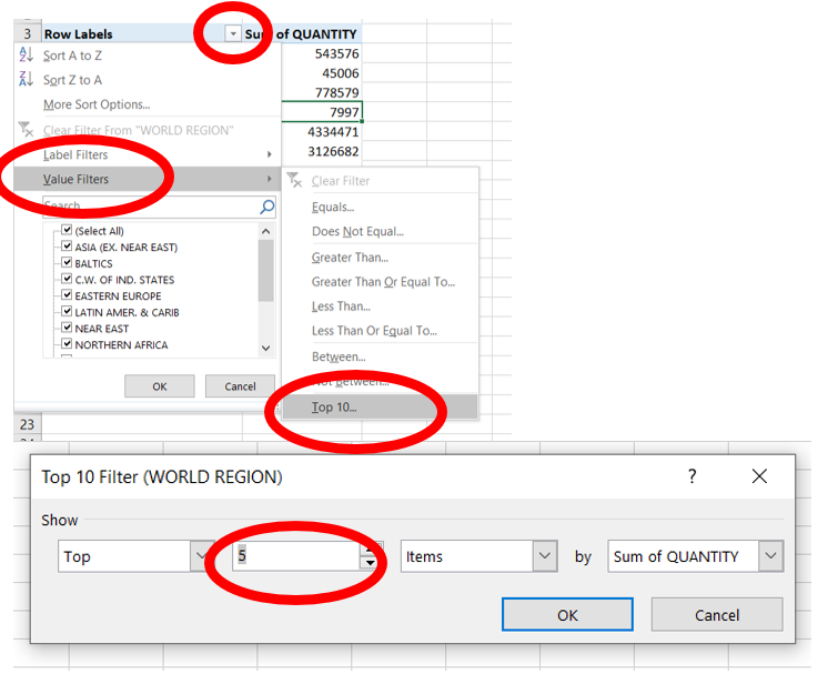
Sort the five values in ascending order that remain after the value filter. Insert a pie chart, remove the legend, add data callouts.
Do you like this output? Would you want to pick something else?
The following are links to the Official Microsoft documentation on chart types that are (were) new in 2016 compared to previous iterations. Please visit each page and pick your favorite. In our next lab, we will see how we can combine Excel Charts with PivotChart in static and dynamic dashboards.
Exercises
Answer the following questions using slicers you build and additional slicers you may have to add on.
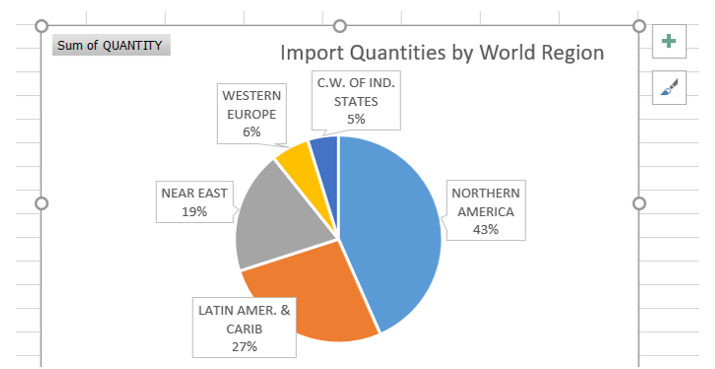
Question: What percentage of the top 5 world region import come from the LATIN AMER. & CARIB world region?
Answer: 27%
Question: Which World Region is the highest percentage of crude oil imported from?
Answer: Northern America
Question: How many thousands of barrels of crude oil arrive from the Northern America region?
Answer: 5,999,566
Which US region imports the most Jet Fuel-Kerosene Type?
Answer: West
