
Learning Objectives
Create summary outputs, develop a dashboard to highlight notes of importance in your data.
Process: Use the Selection, Visualization, and Fields panes to summarize and analyze data.
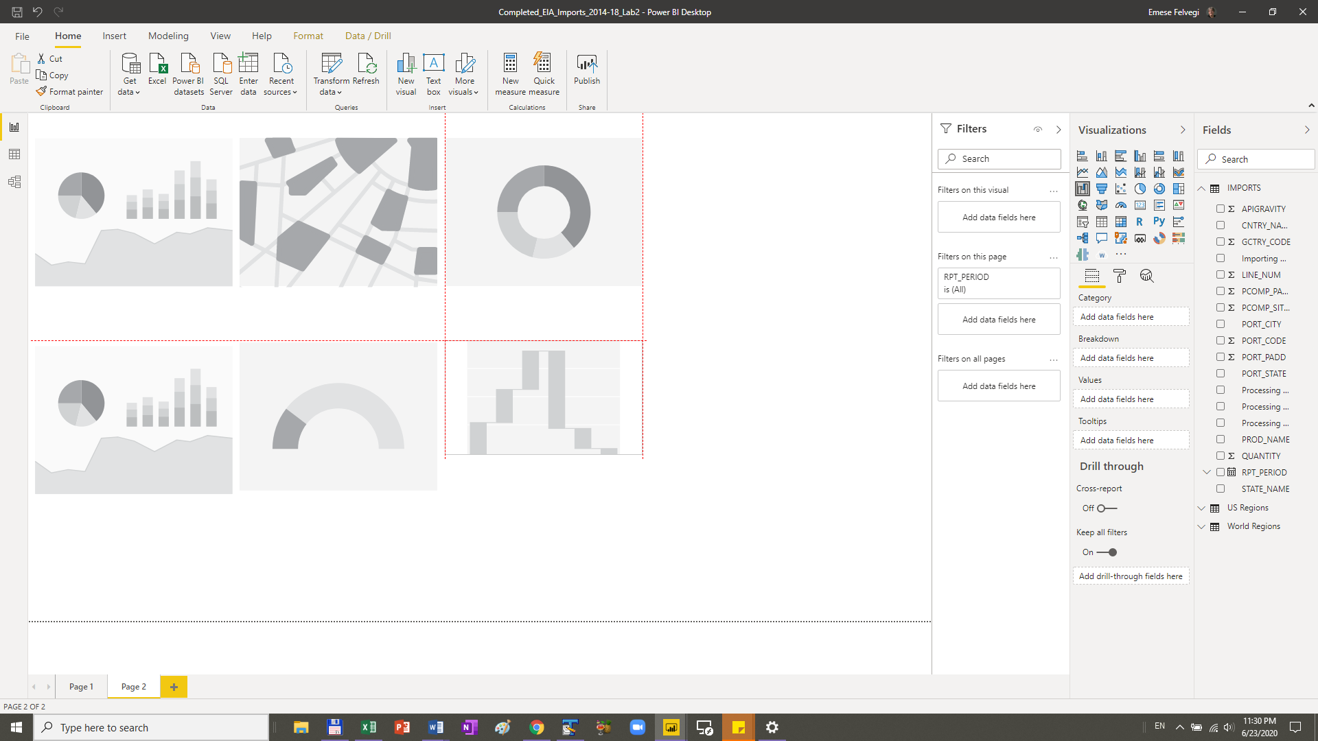
Step 1: Open your EIA_Imports_2014-18_Lab2.pbix file you completed in the previous lab and save it as EIA_Imports_2014-18_Lab2.pbix. We ended that lab with three items on our dashboard (top left). Before we move on further, I would like you to consider your readings from the Berengueres textbook and the associated lecture recording and sample dashboards therein (top right) and the two additional dashboards below.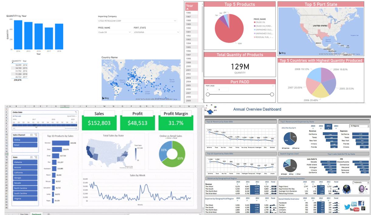
Observe these dashboards and consider items of importance:
- The Elements of Art (Composition, Line, Shape and Form, Space, Color, Texture)
- The Principles (Emphasis, Balance, Contrast, Proportion, Pattern, Movement, Unity)
- The Process (Brainstorm, Build, Give/Get Feedback, Revise, Reflect)
- The Psychology (Cognitive overload, Mood, Impact)
In the next few steps, we will add more cards and visualizations to our dashboards. For every element we add, I would like you to consider if/when/how it adds value to what you are trying to show with your data. If it adds value, use it with your data set. If not, then save it for a rainy day.
We will be working with visualizations not in our Desktop app by default. We will be adding these to have a greater variety of options when we brainstorm or build our dashboards. An overview of visualization is available from the official Power BI source at this page. Please visit this page to preview available options and to see if you may already have some ideas or preferences for shapes, default colors, or other features these items may add to your dashboard.
You may also take a moment to reflect on what you have done in Excel with Excel Chart and PivotCharts. Did you have a favorite there? Excel 1016 gave us Histograms, Map charts, Sunbursts, Treemaps, and Waterfalls. Many of these would work with smaller data sets, but not as PivotTable visualizations. In Power BI, we have them in all their glory, available for us to give a wide range of options to pick from. The challenge is to find the ones that work the best.
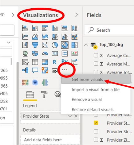
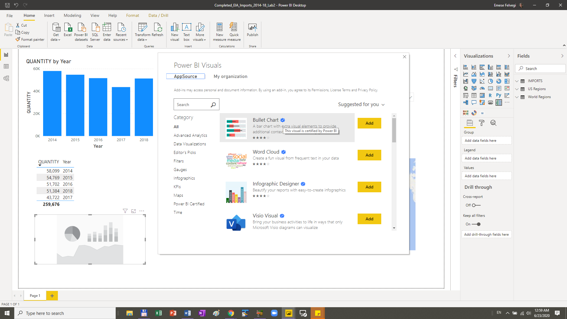
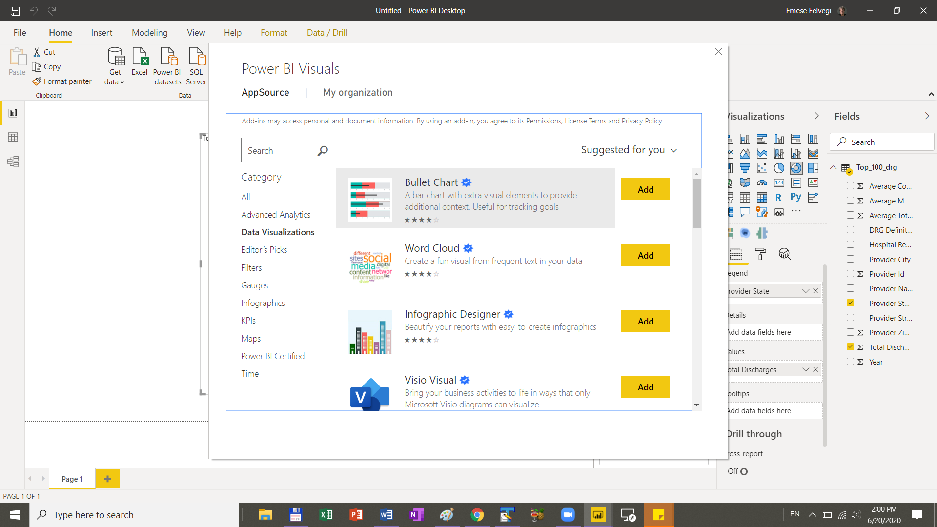
Step 2: Under the Visualizations pane, click the three dots/ellipsis and click “Get more visuals”.
Step 3: Locate and Add Visuals to your Power BI app. Preview options you may like and “Add” them. I am very fond to the Treemap and Waterfall charts.
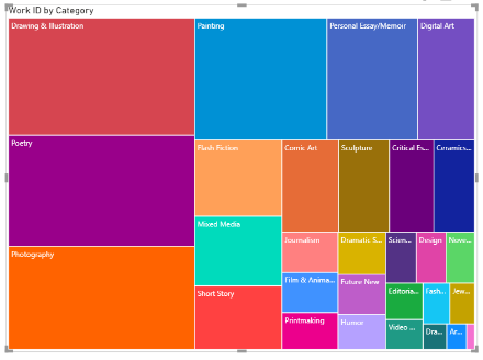
“Treemaps display hierarchical data as a set of nested rectangles. Each level of the hierarchy is represented by a colored rectangle (branch) containing smaller rectangles (leaves). Power BI bases the size of the space inside each rectangle on the measured value. The rectangles are arranged in size from top left (largest) to bottom right (smallest).” Source.
“Waterfall charts show a running total as Power BI adds and subtracts values. They’re useful for understanding how an initial value (like net income) is affected by a series of positive and negative changes.” Source.
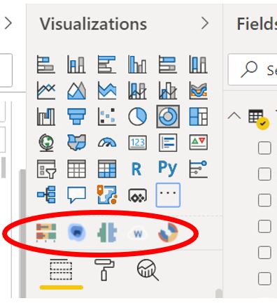
There are different iterations included, mind the reviews, the little icon noting that a specific “This Visual is certified by Power BI”.
I quite like Bullet Charts. A bullet chart is basically “A bar chart with extra visual elements to provide additional context. Useful for tracking goals. Bullet chart serves as a replacement for dashboard gauges and meters. Bullet charts were developed to overcome the fundamental issues of gauges and meters.” Source.
In the end, I ended up with a Bullet Chart, a Heat Map, a Tornado, a Word Cloud, and Sunburst in addition to my Treemap. You can “pin” these to your default visualizations by right-clicking them.
Step 4: We have a basic understanding of our context. We have a general idea of what we want to accomplish with our dashboard in terms of a narrative. Next we are going to add some Visualizations to our dashboard and see if they work for the purposes of our overall goals.
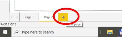
Add a new page in the lower left corner to determine if we should keep whatever we make or not. New pages are always helpful if you wish to focus on specific items, add topical pages, or just to store some of our works in progress.
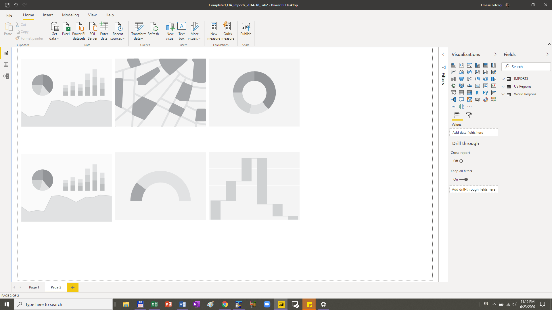
Next, stack all your Visualizations in to evaluate them side by side. I added all of my favorite items to have 6 of them side by side and see if I can make them work. Your interface should look something like this, but can be different based on your personal preferences. I have two types of gauges, a map, a sunburst, a donut, and a waterfall.
Hint: If your items don’t auto-align, you can drag them and gridlines will appear to help you align your Visualizations.
This is the time for experimentation! Click into one of your new Visualizations and add fields to it. Does the output you get make sense? Does it add value to your report? Do this with at least 3-4 more Visualizations and get feedback from others or Prof. Felvegi.
Step 5: Experiment with formatting your cards, charts, backgrounds, etc. Rather intuitively, you can recolor your cards, visualizations, backgrounds and more… The challenge becomes to have the ability to stop yourself. In time so that you spend more time on reporting than tweaking settings for dozens of individual items with hundreds of different options…
Step 6: You’ve brainstormed ideas or came across ideas while working Power BI Desktop. You built a basic dashboard. Have you gotten feedback, then revised your work.
What I would like for you to do next is reflect on how you’ve learned best. Was it through interacting with others? Was it through looking at someone else’s work? Was it through intuitively navigating the interface?
There’s no one right way to do how to tweak and adjust colors or layouts or designs or reports. The goal is not how snazzy your dashboard looks, but how compelling a story, or what kind of narrative it tells.
Next: We will create and manage relationships so that we can connect to data across tables, the web, or other sources. We will also look at features in Power BI Service to see how we can leverage insights that application can provide us with.
