
Chapter 0: Geologic Skills
The 2nd edition is now available! Click here.
Learning Objectives
The goals of this chapter are to:
- Get to know your classmates
- Summarize the importance of making observations
- Practice sketching for geologic interpretations
- Review the usage of Google Earth
- Create and interpret graphs
- Recognize geologic maps
0.1 – Let’s Get Started
“Chapter 0? I’ve never seen that before; what an odd way to start the book.”
Is it unconventional? Yes, but we like to think this is a more effective way of preparing you for the activities in this lab manual because, let’s be honest, did you read the Preface? Probably not, and you would have missed all of this handy information to help make your life easier if we had put this material in there.
This lab manual assumes that most users have already taken an introductory geology course, such as Physical Geology or Earth Systems. Can you remember anything from your intro course? What about some of the basic physical processes and vocabulary such as types of plate boundaries, rocks and the rock cycle, and different classes of minerals such as silicates, carbonates, and oxides? Do you remember much about the geologic time scale or some of the principles that geologists use to date events in Earth’s history? If you think you need to review some of these, we recommend browsing through some of those topics at the following open educational resources (OER):
- Physical Geology 2e – An OER textbook for introductory geology developed by faculty from Earth science departments at universities and colleges across British Columbia and elsewhere.
- An Introduction to Geology – An OER textbook for introductory geology developed by a team at Salt Lake Community College.
- Physical Geology Laboratory: Animations and Interactive Questions – An OER lab book by Elizabeth A. Johnson that supplements labs and lets you practice skills you have learned.
In any case, the first few chapters are designed to review this material and do more advanced investigations for these topics. Some of you may be wondering about this, though: Can you complete the exercises in this lab manual without having a previous geology course? If you’re the type of student who stays on top of their academic pursuits or easily picks up on new material/concepts, then you most likely won’t have an issue. If this doesn’t describe you, though, you may find you need to review the material in the OER links above a little more closely.
0.2 – Academic Integrity
As Benjamin Franklin said, “Honesty is the best policy,” and we believe students should follow this adage. However, in this digital age, cheating has become easier, and catching it has become harder, especially with large class sizes. Believe it or not, academic integrity (AKA cheating and plagiarism) is a major issue at most universities. The International Center for Academic Integrity conducted a survey of undergraduate and graduate students between 2002 and 2015. They found that 68% of undergraduate students and 43% of graduate students admitted to cheating on exams or other graded work at some point. That’s a staggering yet eye-opening statistic. To put that in perspective, if your lab class has 25 students, that means about 17 of your classmates have probably cheated at some point in their college career.
One of the common issues we have found with academic honesty cases is that students don’t know they are cheating or plagiarizing. To help you understand this a bit more, we’ve put together a list of common offenses:
- Plagiarism – presenting someone else’s work as your own
- Cheating – getting an unfair advantage in a test
- Misrepresentation of facts – distorting the truth or your data
- Encouraging or helping anyone else do any of these things
In this lab, you may benefit from discussing concepts and exercises with your fellow students, teaching assistants, and professors, which brings us to another gray area: group work. Many of the exercises in this lab manual are best completed in small groups where each member’s strengths and weaknesses will shine. This is not a bad thing but rather an opportunity to experience peer-to-peer learning, an effective learning strategy. Working with others will help you solve the exercises in this lab manual, but the answers you turn in must be written in your own words. Similarly, sketches and diagrams must also be your own work, and any data collection, graphs, calculations, or measurements must also be your own.
Learning to write clearly is part of what we hope you learn by answering these questions. So, please be an ethical student and follow these suggestions for academic integrity. These policies may vary depending on your university academic code and are general guidelines for how to succeed during these labs as well as in life. If you are interested in understanding more about plagiarism, consider checking out www.plagiarism.org and their section titled “What is Plagiarism?“. Posting images and answers from this lab manual on websites like Chegg and Course Hero violates this work’s copyright, and you can be held liable.
0.3 Skill-building
There are many skills you will need to be successful in this lab, including how to make observations, sketching, knowledge of geography and Google Earth, how to compile data, plot it on a graph, and how to interpret that graph. This information may be overwhelming or sound scary right now, but we have designed the exercises in this lab manual to guide you through these skills.
Making Observations
Being able to make observations is a critical skill for most of the exercises in this manual. Through our years of teaching, we’ve come to realize that students have a difficult time making observations. This is probably a result of the trend in education towards standardized testing, but that’s a discussion for another time.
Exercise 0.1 – Observing and Sketching: Part 1
Before reading any further, let’s see where you stand in terms of your observation skills. Using the space below, create a sketch of the photo in Figure 0.1 and annotate any observations you can make. Note: there is no right or wrong answer here; it is merely a means of seeing what you observe.
| Sketch Area: |
Open your eyes and take note of what is in front of you. It sounds simple, but how do you know what to look at? That’s the challenge for students making geologic observations; they don’t know what to look for at first. Take a look at Figure 0.1; what do you see? What’s the first thing you notice? Is it the clouds? Is it the mountain in the background? Were you able to tell the mountain is a volcano (It’s Mount St. Helens)? Did you note the landscape around the volcano is barren? What about visible features of an area of land, its landforms? Or how about that the landscape appears very smooth for being located in a mountainous region? What about the small valleys carved into the landscape?
Mount St. Helens had a major eruption in 1980 that caused the mountain’s northern slope to collapse, creating a major landslide that wiped out all of the vegetation north of the mountain. The landslide was followed by the deposition of volcanic ash and other material, which is why the landscape appears smooth. Those valleys are being carved out by rainfall that forms small rivers; they easily erode the loose volcanic material and create the valleys. The region has yet to recover from this disaster, but vegetation is slowly making its way back in.

Most people think taking pictures is the best way to record what they see; however, this is not always true. The lighting may be wrong, or what needs to be observed is under a mineral coating, or there isn’t a suitable location to take in the entire landscape. Or maybe the opposite; people may need to focus on an area but can’t get close enough. To overcome these challenges, geologists use sketches to capture their observations of rocks, fossils, and landscapes.
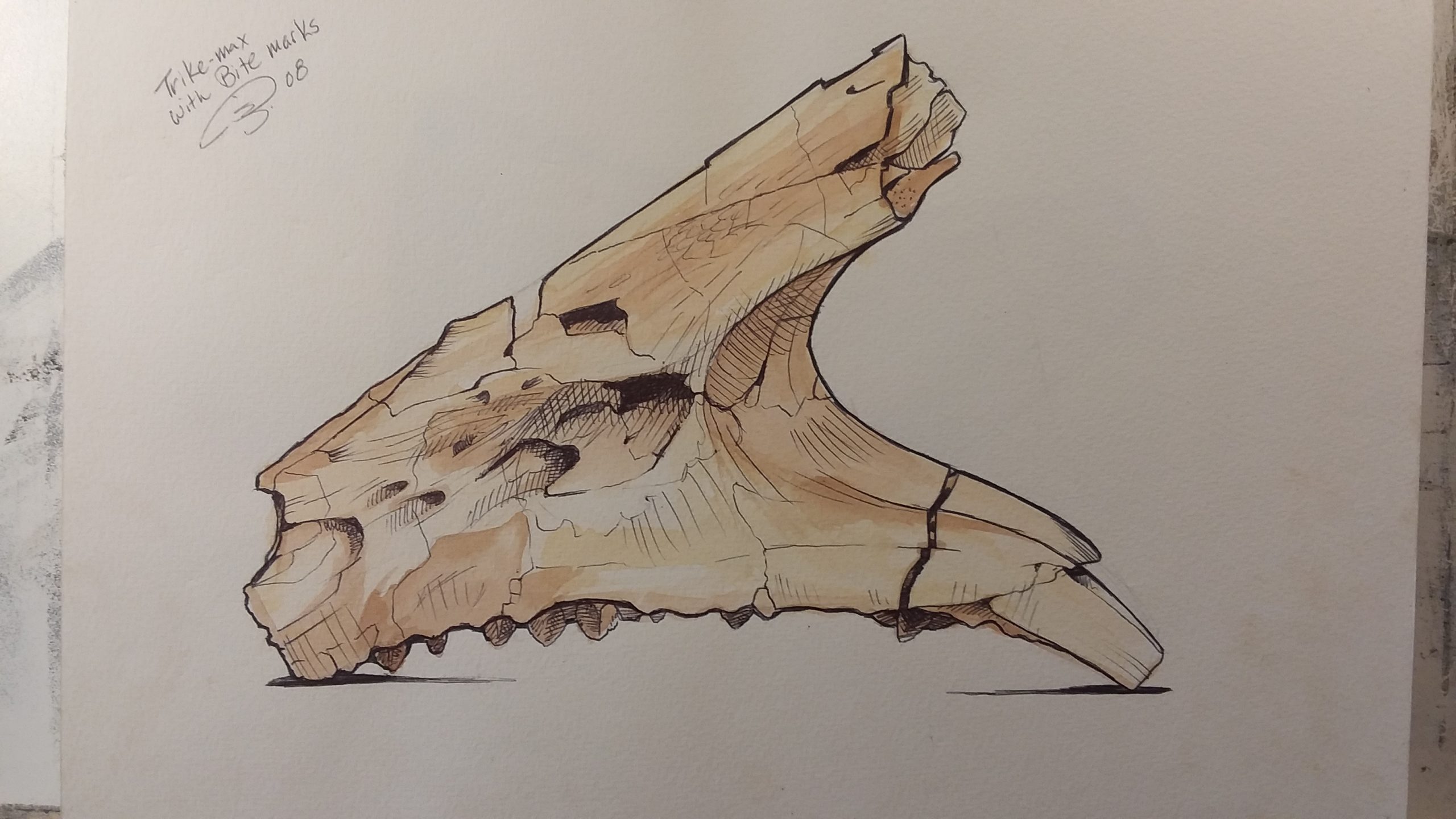
For a geologist, creating sketches has several distinct advantages over taking photos. When creating sketches, you can remove unimportant details, use shading and colors to highlight different aspects, and easily annotate your sketches on-demand in your field notebook. Figure 0.2 is a sketch of a Triceratops jawbone; the sketch allows us to focus on the important aspects of the fossil, rather than being distracted by the background or other unimportant details.
Geologists often find themselves doing fieldwork for weeks at a time in remote areas and don’t always have access to reliable electricity to charge camera batteries or laptops. In those circumstances, sketches are the preferred method of recording observations. Does that mean geologists never take photos? Of course not; any geologist has a trove of photos from field locations they visit, but it’s the sketches that truly help with their interpretations.
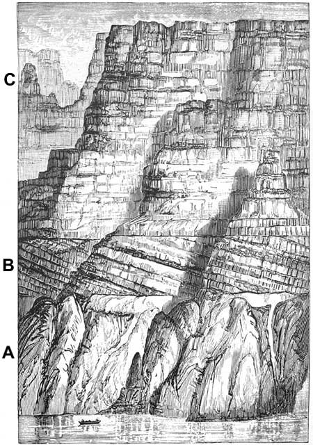
The sketch of the north wall of the Grand Canyon in Figure 0.3 was made by John Wesley Powell, who led the first boat trip through this area in 1869. You can see that he identified three types of rocks and labeled them A, B, and C. Powell was the first to identify the “Great Unconformity” between the rocks at the bottom of section A and the tilted rocks in section B. When making sketches, it is important to include a scale. In this sketch of the Grand Canyon, Powell included a riverboat at the bottom. If possible, use perspective and shading. Finally, annotate your sketches with notes. Annotations can help with the interpretation of parts of your sketch that are difficult to portray correctly.
With all of that said about sketches, you don’t need to be an artist to record what you think is important. And the more practice you get making sketches, the more your sketching skills are going to improve. It is better to sketch quickly instead of spending lots of time making them perfect. If you think some aspects of your sketch are lacking, then make a note of what you are observing.
Exercise 0.2 – Observing and Sketching: Part 2
Search the internet for a geological feature that inspires you. Websites that you can browse for interesting geology are:
- Pictures that will inspire you to become a geologist
- Smithsonian’s list of the ten most spectacular geologic sites
- Awesome geology pictures
- American Southwest geology
- National Geographic’s best geology pictures from ordinary people
- Weird geologic formations
Once you find your geologic muse, complete the following:
- Create a sketch of the feature, and be sure to include some type of scale. Scale is important for the viewer to get a sense of what you are sketching. For instance, what is the size of the Triceratops maxilla in Figure 0.2? It could be massive or tiny? You may think that it is massive using your knowledge of dinosaurs that you’ve seen in museums or elsewhere. But, did you know the smallest dinosaur fossil is ~5 cm (2 inches)? So, add a scale even if there is not one in the picture you are sketching. You can give your best estimate.
- Add some brief comments about any features you can identify. These can be simple comments such as the rocks are red and white. Please note whether these are igneous, sedimentary, metamorphic, or a mix of rock types.
| Sketch Area: |
Geography
Many students learn some basic geography before college, and almost all seem to forget place names once they no longer need to know them for a test. Perhaps the best way to learn this information is to travel and then have memories associated with these places. Oh, you’re not independently wealthy with enough spare time to travel the world? Not to worry, we have embedded several maps and links to Google Earth in this text to showcase some geology of the world and hope you will learn enough to remember some geography after completing this lab manual. You’ll “travel” to the likes of Australia, British Columbia, Eastern Europe, Chile, and Texas, and that’s just in Chapter 1! We do assume, though, that you can remember the seven continents (Yes, Antarctica is a continent, a landmass larger than the United States) and the five oceans.
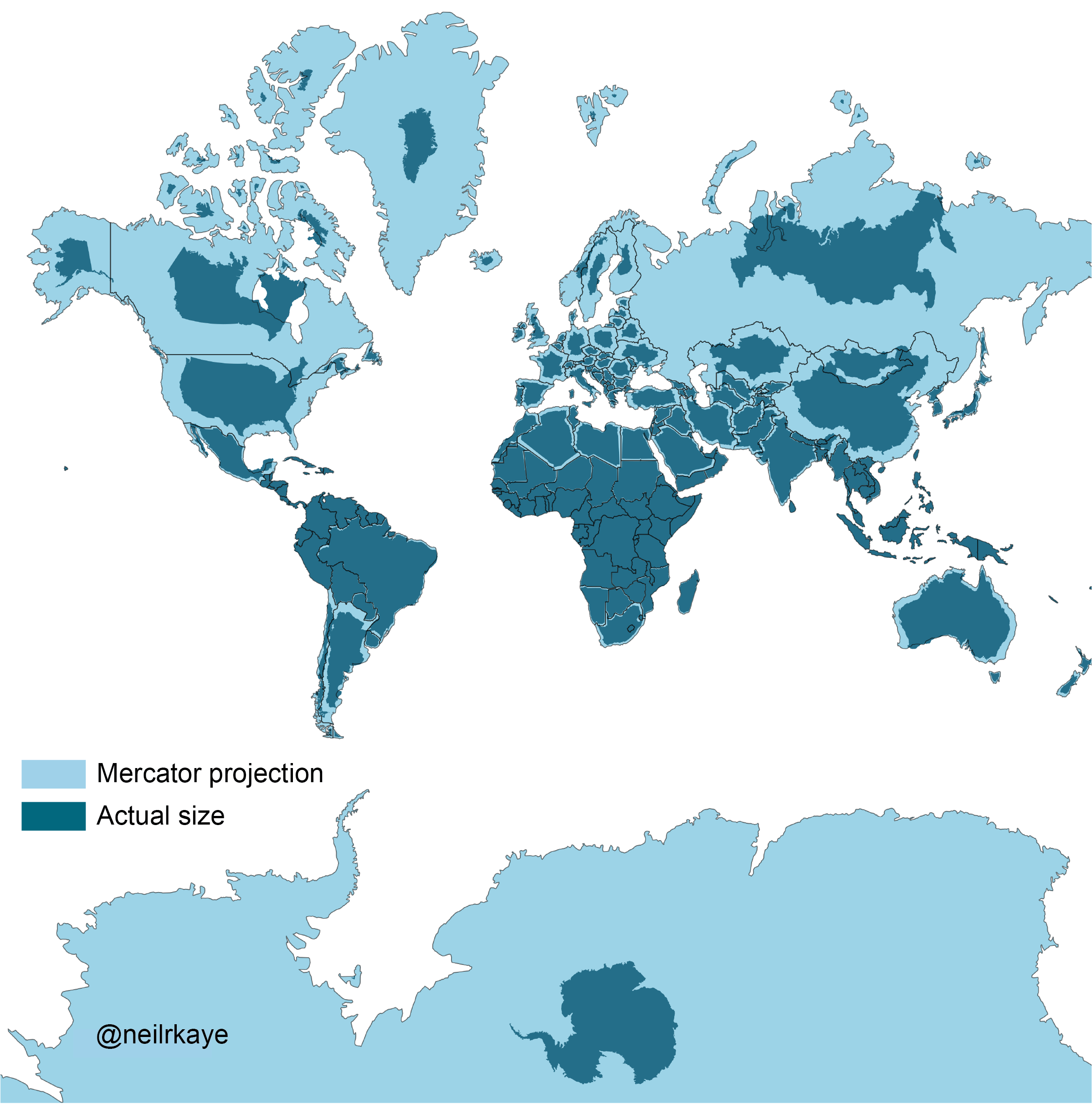
We created many of the maps in this lab manual using Generic Mapping Tools. Most maps are Mercator projections and therefore distort the sizes of continents and distances as latitude increases. This is why the United States looks almost as wide as Africa, when, in reality, it is much smaller than Africa (Figure 0.4). In fact, the United States, China, and India can all fit within the area of Africa with room to spare. You can compare true landmass sizes at The True Size.
Do you remember anything about latitude and longitude? This is the geographic coordinate system to locate any point on Earth; think of it as an address. Latitude is the position north or south of the equator and goes from 0° to 90° north and south. Sometimes negative values are used to represent south. Longitude is the position east or west of the prime meridian, which runs through Greenwich, England, and goes from 0° to 180°. Positive values represent east of the prime meridian, and negative values represent west of the prime meridian.
Exercises 0.3 – True Sizes of Landmasses
Since we live on a three-dimensional globe that is often projected in two dimensions, it is difficult to appreciate the scale of where you live compared to other countries or states on Earth. An easy way to do this is to use The True Size, a computer visualization tool. Once you are on this website, type in the name of your home state or country, which will highlight the area on the map. Then, drag it around the world, comparing it to other countries or states.
- Find a country or state that is a similar size to your home state or country. ____________________
- How does the latitude affect the size of your home state or country?
- What countries are the same size as the United States?
Google Earth (Not Google Maps)
There are many ways to find your location, such as a map app on your digital device. This lab book will use the web version of Google Earth to show you all of the locations mentioned throughout this lab manual. Google Earth is a composite of satellite images, aerial photographs, and GIS data on a globe. Coverage includes about 98% of the Earth. The resolution of the images partly depends on how popular the area is. For example, remote areas in British Columbia, Canada, have a poor resolution in mountainous areas except where commercial logging is done. There are many features in the desktop version of Google Earth, such as historical imagery, measurement tools, three-dimensional imagery, night sky, views of the Moon and Mars, and bathymetry of the ocean floor. As the web version of Google Earth is updated, we hope many of these tools will be incorporated in future releases. Please note that all links in this lab manual open in the same browser window according to accessibility standards, you may want to open Google Earth links in a separate window or tab.
Exercise 0.4 – Using Google Earth
Using Google Earth, find a geologic feature of your choosing (a mountain, fault, desert, specific location, anything really) and answer the following questions about it. You can also use your feature from Exercise 0.2 if you know its location.
- Record the latitude and longitude of your feature.
- Latitude: _______________
- Longitude: _______________
- Since one degree of latitude is ~110km, how far from the equator is your geologic feature?
____________________________ - How about miles? (1km = 0.62 miles) _____________________________
- Using the ruler tool in Google Earth, how far from your house or dormitory is it to this geologic feature in km and miles? (The ruler tool is the last icon on the left-hand menu.)
____________________________
Compiling and Plotting Data
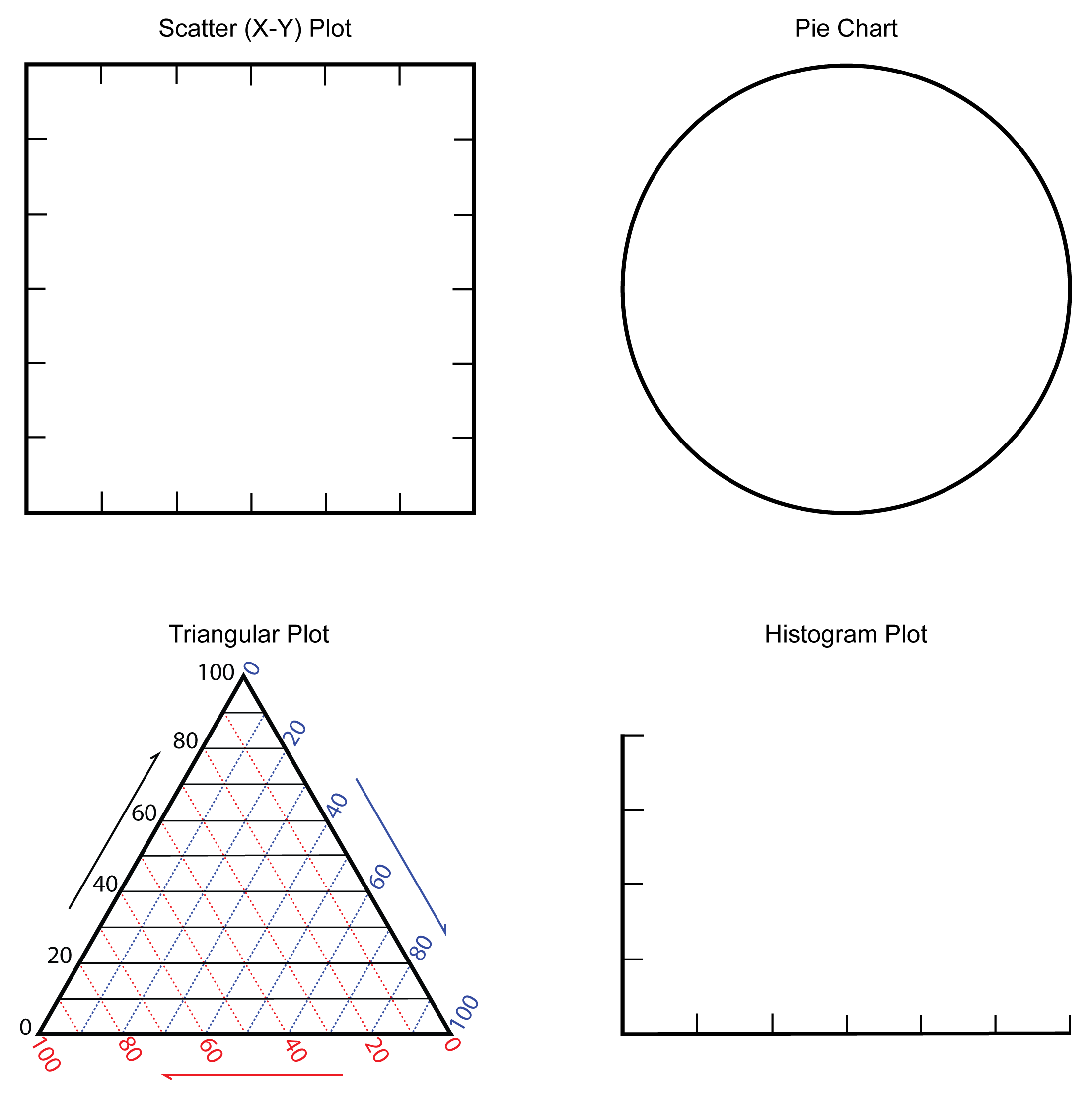
In general, data is either quantitative (a measure of how much of something; for example, the temperature is 10°C) or qualitative (a description of something; for example, the temperature is cold). There are many ways to display data, and the type of data you collect will determine the type of data plot you will need. Simple data plots include pie charts, bar charts, timelines, histograms, and scatter plots. Not all data charts are helpful to interpret trends. Often, we have to try different types of plots to discern what is important about the data. A lack of a trend is also informative because it means that your assumptions are incorrect and there is no relationship in your data set.
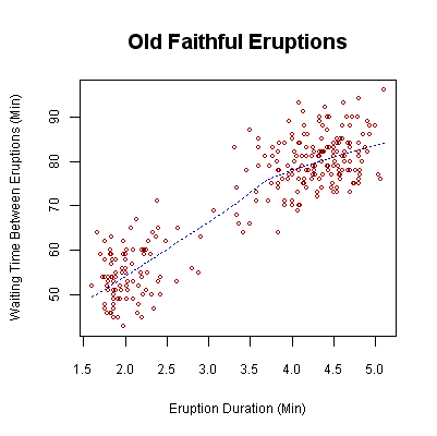
Let’s look at the scatter plot in Figure 0.5. This graph shows a relationship between the time between two eruptions and how long (duration) an eruption lasts. This scatter plot shows two types of eruptions: short eruptions with a short time between them and long eruptions with a long wait time. In this plot, there are not many data eruption durations between 2.5 and 4.0 minutes. So, if we interpolate between these, we can estimate the wait time between eruptions.
Generally, scientists look to see if the data is correlated, meaning they are looking for a relationship or pattern. Suppose there is a positive correlation; as one variable increases, so does the other, just like Old Faithful eruptions (Figure 0.5). In this plot, as the duration of the eruption increases (x-axis), so does the time between eruptions (y-axis). Data can also be negatively or inversely correlated; as one variable increases, the other decreases. For example, as an earthquake’s magnitude increases, its frequency (how often it occurs) decreases.
Most geoscientists use spreadsheet programs such as Microsoft Excel or Google Sheets to analyze their numerical data. You may not yet be familiar with these programs, but there are many tutorials available online. Check out this tutorial at Excel Easy or look at an Excel guide to help you get started. Excel is a powerful program that simplifies many tasks. You will find that many companies and organizations universally use it. Plus, if you learn one program, you will be able to use other programs because many of these software packages are very similar.
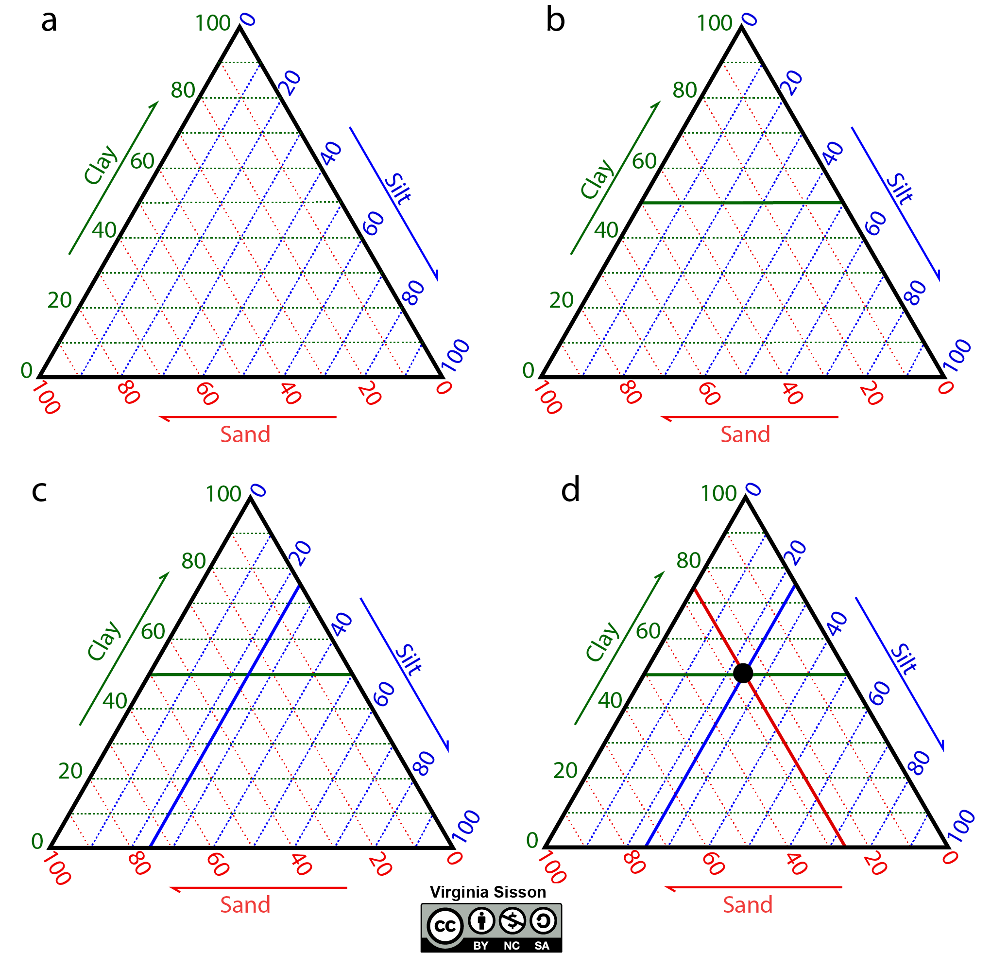
In geosciences, we often collect data that has three components, such as grain size in sedimentary rocks and soil, to classify samples using the proportions of sand, silt, and clay-sized particles. These data are displayed on triangular plots (sometimes known as ternary plots) (Figure 0.6). For most applications, the three variables (a, b, c) add up to one hundred percent. Since a + b + c = 100 for all components, any one variable is not independent of the other two. Only two variables are on the graph as c=100−a−b.
Exercise 0.5 – Plotting Data
Collect some data from your classmates. This is up to you as a class to decide on at least two items. Examples are: how far from school do they live, what is their major, height, favorite color, how many have dark hair versus blonde or red hair, how many steps do they take in an average day, how many letters in their names (first, last, nickname, all three), what kind of pet do they have, what is their resting heart rate, etc. Record your data in the space below.
There are many ways to display data. In general, data is either quantitative related to counts of something or qualitative about information that can’t be measured. Make a graph of your data using one of the blank graphs in Figure 0.7. If you have two quantitative (numerical) items, you should make a scatter plot. If you have only quantitative data, you can create a pie chart, bar chart, or histogram.
- What does your graph(s) tell you about your classmates?
0.4 Reading and Creating Geologic Maps
The ability to read a geologic map will be necessary, especially for the second half of this lab manual. A geologic map contains stories about the region that is covered. Maps contain information about what is on Earth’s surface as well as below. You can use them to make a three-dimensional picture of your surroundings. Another way to think about it is a geologic map is to a geology major as a wrench is to a mechanic.
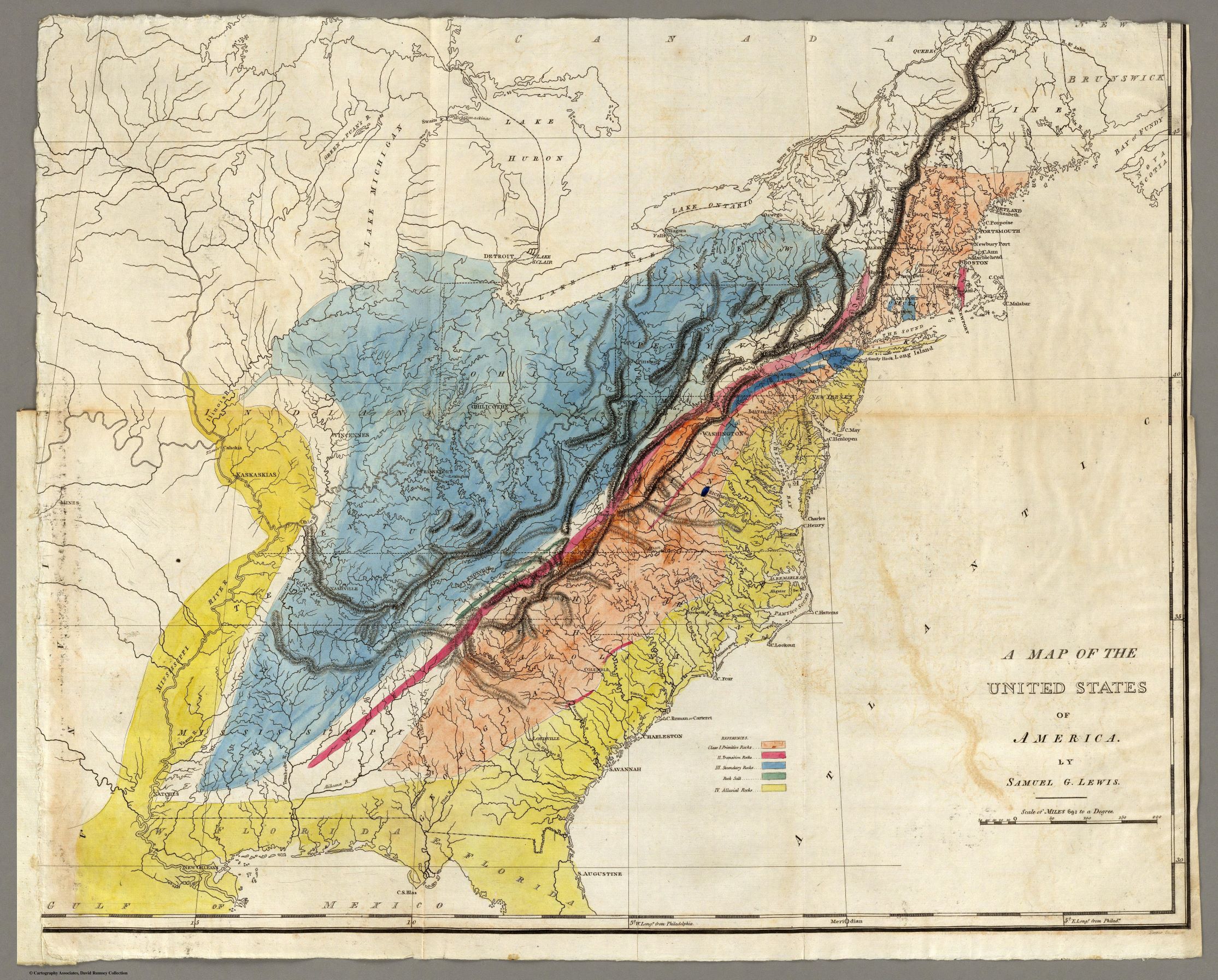
Figure 0.8 shows the first geologic map of the U.S. published by William Maclure in 1809. He subdivided the rocks into five types based on the Werner classification. This classification, however, is no longer accepted, and not many people know about this map. Despite this, Maclure made a heroic effort to produce this map. He supposedly crossed the mountains over fifty times to get the details correct, with walking and horseback as his only means of transportation.
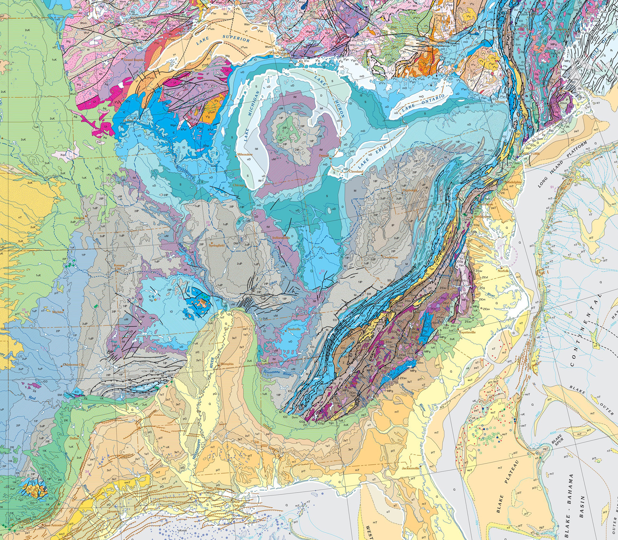
To an untrained eye, a modern geologic map (Figure 0.9) is a maze of colors in fantastical patterns. We purposefully did not include a legend for this map because it would be too complicated for most geology padawans. By the end of this book, though, you will have everything you need to be a geology master. For now, the colors represent geologic units, which are subdivided by time and rock types. Many geologic maps use a standard color scheme with colors related to the geologic time scale, such as shades of yellow for Quaternary units and blues for Paleozoic units. Still, sometimes the colors used are unique to the kind of geologic map. The geologic map on this lab book’s cover is for the Grand Canyon region and is mostly blue. So, you can easily guess that most of this area is made of Paleozoic rock units. The standard color scheme used in the United States is available on the USGS website. Between these colored units are lines or contacts. The width and type of line designate the type of contact, such as fault (solid line), intrusive contact (dashed line), or contact that is covered by unconsolidated rocks (dotted line). Typically, there is a legend that identifies the type of line with different types of contacts.
Do geologic maps intimidate you? Not to worry, we will break them down for you later on so you can walk away from this class like a map-reading pro. Now, on to Chapter 1.
Additional Information
Exercise Contributions
Virginia Sisson, Daniel Hauptvogel, and Ana Vielma
Google Earth Locations
the edge of either a continental or oceanic tectonic plate
a concept in geology that describes transitions among the three main rock types: sedimentary, metamorphic, and igneous
visible features of an area of land and its landforms
a landscape that lacks plant or animal life
fragments of rock, minerals, and volcanic glass, created during volcanic eruptions and measuring less than 2 mm in diameter
larger fragments of rock, minerals, and volcanic glass created during volcanic eruptions and measuring more than 2 mm in diameter
a buried erosional or non-depositional surface separating two rocks or strata of different ages, indicating that sediment deposition was not continuous
a map projection of the world onto a cylinder so that all the latitude lines have the same length as the equator
the depth of water in oceans, seas, or lakes
a graph that depicts the ratios of the three variables as positions in an equilateral triangle
a system that geologists use to relate chronological dating to geological strata (stratigraphy)
a boundary which separates one rock body from another. These can be depositional, unconformable, and intrusive contacts
