4.5 Chapter Assessment
1. The line chart is best to illustrate _______________.
a) comparisons
b) trends over a period of time
c) interrelationships between large data sets
d) correlations between pairs of values
2. A pie chart can depict _____ data series
a) 1
b) 2
c) 3
d) 4
e) depends on the number of slices in the pie
3. You cannot change the source of your data once you have inserted it, you have to start from scratch.
a) True
b) False
4. Based on Step 5 of your Chapter 4 practice problem. The total for the top ten sources of U.S. crude oil imports for YTD 2019 is:
a) 6,080
b) 6,312
c) 6,450
d) 6,512
5. Based on Step 6 of your Chapter 4 practice problem. Crude oil imports for the top 10 averaged _______ b/d in March 2019:
a) 608
b) 624
c) 651
d) 677
6. After step 9 of your Chapter 4 practice problem, your pie chart shows that crude imports from Colombia were _____ of YTD 2019.
a) 4%
b) 6%
c) 10%
d) 12
7. After step 11 of your Chapter 4 practice problem, your pie chart shows that crude imports from Colombia were _____ of YTD 2019.
a) 5%
b) 7%
c) 17%
d) 20%
8. The pioneer of data visualization is:
a) Alan Turing
b) Edward Tufte
c) Grace Hopper
d) Michael Porter
9. The pioneer of data visualization calls unnecessary chart elements:
a) clutter
b) fluff
c) junk
d) trash
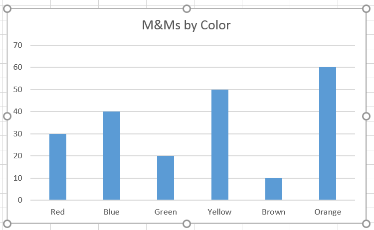
10. This is a _______.

a) Bar graph
b) Column chart
c) Pie chart
d) Line chart
Solutions: 1b, 2a, 3False, 4b, 5b, 6b, 7a, 8b, 9c, 10b
Attribution
Practice problems by Emese Felvégi based on chapter content and chapter practice. CC BY-NC-SA 3.0.

