
4.2 Formatting Charts
Learning Objectives
- Apply formatting commands to the X and Y axes.
- Enhance the visual appearance of the chart title and chart legend by using various formatting techniques.
- Assign titles to the X and Y axes that clarify labels and numeric values for the reader.
- Apply labels and formatting techniques to the data series in the plot area of a chart.
- Apply formatting commands to the chart area and the plot area of a chart.
- Employ series lines and annotations to enhance trends and provide additional information on a chart.
You can use a variety of formatting techniques to enhance the appearance of a chart once you have created it. Formatting commands are applied to a chart for the same reason they are applied to a worksheet: they make the chart easier to read. However, formatting techniques also help you qualify and explain the data in a chart. For example, you can add footnotes explaining the data source as well as notes that clarify the type of numbers being presented (i.e., if the numbers in a chart are truncated, you can state whether they are in thousands, millions, etc.). These notes are also helpful in answering questions if you are using charts in a live presentation. We will demonstrate these formatting techniques using the column chart and stacked column chart from the previous section.
X and Y Axis Formats
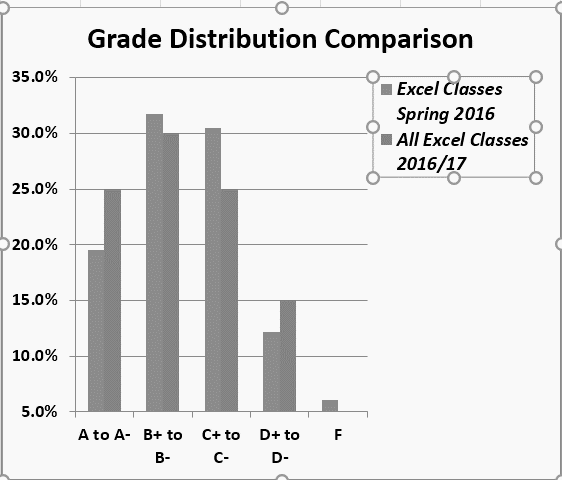
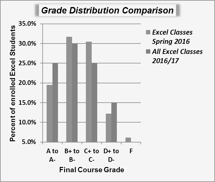
There are numerous formatting commands we can apply to the X and Y axes of a chart. Although adjusting the font size, style, and color are common, many more options are available through the Format Axis pane. The following steps demonstrate a few of these formatting techniques on the Grade Distribution Comparison chart:
- Switch to the Grade Distribution worksheet and click anywhere along the X axis (horizontal axis) of the Grade Distribution Comparison chart.
- Right click and select Font.
- Change the font to Arial, the Font Style to Bold, and the Size to 11 (see Figure 4.26).
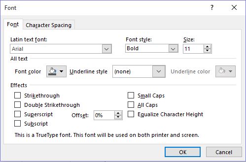
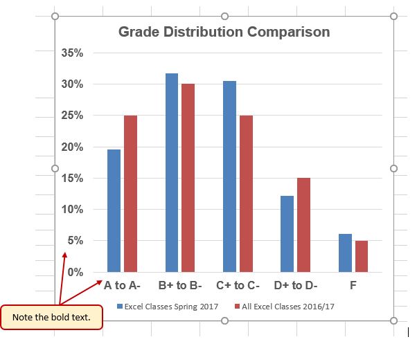
Figure 4.26 Font Dialog Box - Click anywhere along the Y axis to activate it and repeat steps 2 and 3.
- Click on the chart title and repeat steps 2 and 3, but set the Size to 14.
- The final appearance of the axes is shown in Figure 4.27 Formatted X & Y Axes.
Next we want to make some changes to the percentage numbers on the Y (vertical) axis.
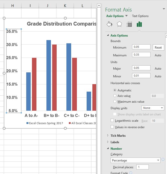
- Right click the vertical (value) axis. Select Format Axis. This opens the Format Axis pane.
- Click Number from the list of options. The commands in this section of the Format Axis pane are used to format numbers that appear on the selected axis of the chart.
- Click in the Decimal places input box and change the value to 1.
- Select Axis Options. Change the Minimum Bound to .05 to make the differences in the columns more dramatic. The Format Axis pane should match Figure 4.28.
- Click the Close button at the top of the Format Axis pane.
- Save your work.
Skill Refresher
Formatting the X and Y Axes
- Click anywhere along the X or Y axis to activate it.
- Click either the Home tab or Design tab of the ribbon.
- Select any of the available formatting commands in these tabs.
Skill Refresher
X and Y Axis Number Formats
- Click anywhere along the X or Y axis to activate it.
- Click the Layout tab in the Chart Tools section of the ribbon.
- Click the Format Selection button in the Current Selection group of commands.
- Click Number from the list of options on the left side of the Format Axis dialog box.
- Select a number format and set decimal places on the right side of the Format Axis dialog box.
- Click the Close button in the Format Axis pane.
Chart Legend and Title Formats
The next items we will format on the Grade Distribution Comparison chart are the chart legend and title. Similar to the how we formatted the X and Y axes, we can format these items by activating them and using the formatting commands in the Home tab or the Format pane. The following steps explain how to add these formats:
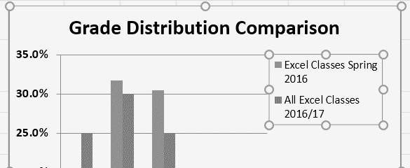
- Right click the legend on the Grade Distribution Comparison chart and select Format Legend.
- Select Right in the Legend Position options. Close the Format Legend pane.
- Move the legend by placing your cursor – shaped like a little plus sign with four arrows – on the edge of the selection box. Click and drag the legend so the top of the legend aligns with the 35% line next to the plot area (see Figure 4.29).
- While the legend is still selected, change the font style in the Home tab of the ribbon to Arial.
- Change the font size to 12 points.
- Click the bold and italics commands in the Home tab of the ribbon.
- Click and drag the left sizing handle so the legend is against the plot area (see Figure 4.30).
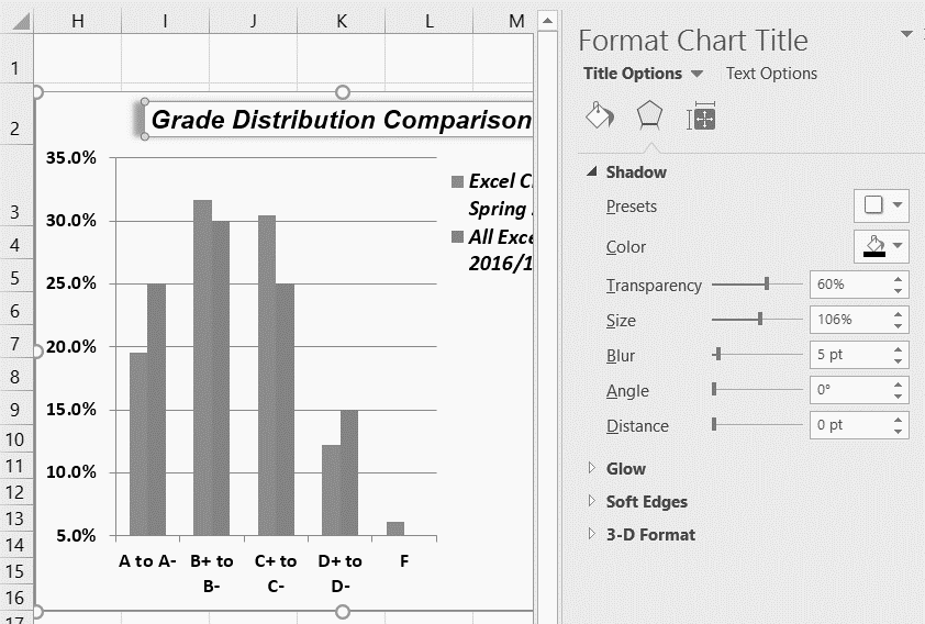
- Click the chart title to activate it.
- Right click on the chart title and select Format Chart Title to open the Format Chart Title pane.
- Under Title Options , in the Effects group (the option in the middle) give your title one of the Preset shadows. Change the color, if you like.
- Close the Format Chart Title pane.
- Save your work.
Skill Refresher
Formatting the Chart Legend
- Click the Legend to activate it.
- Click either the Home tab or right click to activate the appropriate formatting pane.
- Select any of the available formatting commands.
- Click and drag the legend to move it.
- Click and drag any of the sizing handles to adjust the size of the legend.
Skill Refresher
Formatting the Chart Title
- Click anywhere on the chart title.
- Click either the Home tab or right click to activate the appropriate formatting pane.
- Select any of the available formatting commands.
X and Y Axis Titles
Titles for the X and Y axes are necessary for defining the numbers and categories presented on a chart. For example, by looking at the Grade Distribution Comparison chart, it is not clear what the percentages along the Y axis represent. The following steps explain how to add titles to the X and Y axes to define these numbers and categories:
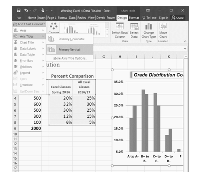
- Click anywhere on the Grade Distribution Comparison chart in the Grade Distribution worksheet to activate it.
- On the Design tab on the ribbon select the Add Chart Element button, then Axis Titles, then Primary Vertical. (See Figure 4.32)
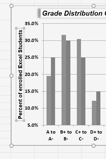
- Using the Home ribbon, change the font of the axis title to Arial, Bold, size 11.
- Click in the beginning of the Y axis title and delete the generic title. Type Percent of Enrolled Excel Students.(see Figure 4.33).
Next we will add the title for the X axis.
- On the Design tab select the Add Chart Element button, then Axis Titles, then Primary Horizontal.
- Using the Home ribbon, change the font of the axis title to Arial, Bold, size 11.
- Click in the beginning of the X axis title and delete the generic title. Type Final Course Grade. Figure 4.34 shows the added titles for the X and Y axes. The titles provide definitions for the grade categories along the X axis as well as the percentages on the Y axis.
- Save your work.
Skill Refresher
X and Y Axis Titles
- On the Design tab select the Add Chart Element button.
- Click anywhere on the chart to activate it.
- Select one of the options from the second drop-down list.
- Click in the axis title to remove the generic title and type a new title.
Attribution
Adapted by Noreen Brown from How to Use Microsoft Excel: The Careers in Practice Series, adapted by The Saylor Foundation without attribution as requested by the work’s original creator or licensee, and licensed under CC BY-NC-SA 3.0.
