
4.1.C: Choosing a Chart Type: Pie Chart
Percent of Total: Pie Chart
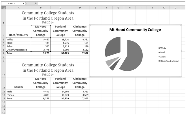
The next chart we will demonstrate how a pie chart works. A pie chart is used to show a percent of total for a data set at a specific point in time. The data we will use to demonstrate a pie chart is related to enrollment data for Portland Area Community Colleges for Fall of 2014. You will find that data on the Enrollment Statistics sheet in your CH4-Data_File.
- Highlight the range A2:B6 on the Enrollment Statistics worksheet.
- Click the Insert tab of the ribbon.
- Click the Pie button in the Charts group of commands.
- Select the first “2-D Pie” option from the drop-down list of options.
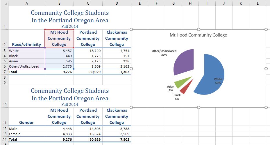
- To make the “slices” stand out better, “explode” the pie chart.
- Click and hold the mouse button down in any of the slices of the pie.
- Note that you have selection handles on all of the pie slices.
- Without letting go of your mouse button; drag one of the slices away from the center.
- All of the slices “explode” out from the center.
- Click off the slices and into the white canvas to deselect the pie and select the entire chart.
- Click and drag the pie chart so the upper left corner is in the middle of cell E2.
- Resize the pie chart so the left side is locked to the left side of Column E, the right side is locked to the right side of Column L, the top is locked to the top of Row 2, and the bottom is locked to the bottom of Row 10 (see Figure 4.19).
- Click the chart legend once and press the DELETE key on your keyboard. A pie chart typically shows labels next to each slice. Therefore, the legend is not needed.
- Right click any of the slices in the pie chart, and select Add Data Labels from the list. This will add the values for each of the slices in the pie.
- Now, you can right click one of the numbers and select Format Data Labels from the list. This will open the Format Data Labels pane on the right.
- Check the boxes for Category Name and Percentage in the Label Options section in the Format Data Labels pane. This will add the Race/ethnicity labels as well as the percentage data to the pie chart.
- Uncheck the box next to the Value box. This will remove the numbers from the pie chart (see Figure 4.20).
- Click the Close button at the top of the Format Data Labels pane.
- Select the data labels again (if needed). Click the Home tab of the ribbon and then click the Bold button. This will bold the data labels on the pie chart.
- Save your work.

Although there are no specific limits for the number of categories you can use on a pie chart, a good rule of thumb is ten or less. As the number of categories exceeds ten, it becomes more difficult to identify key categories that make up the majority of the total.
Skill Refresher
Inserting a Pie Chart
- Highlight a range of cells that contain the data you will use to create the chart.
- Click the Insert tab of the ribbon.
- Click the Pie button in the Charts group.
- Select a format option from the Pie Chart drop-down menu.
Key Takeaways
- Identifying the message you wish to convey to an audience is a critical first step in creating an Excel chart.
- Both a column chart and a line chart can be used to present a trend over a period of time. However, a line chart is preferred over a column chart when presenting data over long periods of time.
- The number of bars on a column chart should be limited to approximately twenty bars or less.
- When creating a chart to compare trends, the values for each data series must be within a reasonable range. If there is a wide variance between the values in the two data series (two times or more), the percent change should be calculated with respect to the first data point for each series.
- When working with frequency distributions, the use of a column chart or a bar chart is a matter of preference. However, a column chart is preferred when working with a trend over a period of time.
- A pie chart is used to present the percent of total for a data set.
- A stacked column chart is used to show how a percent total changes over time.
Attribution
Adapted by Noreen Brown from How to Use Microsoft Excel: The Careers in Practice Series, adapted by The Saylor Foundation without attribution as requested by the work’s original creator or licensee, and licensed under CC BY-NC-SA 3.0.
