
4.1.B: Choosing a Chart Type: Column Charts
Frequency Distribution: Column Chart 1
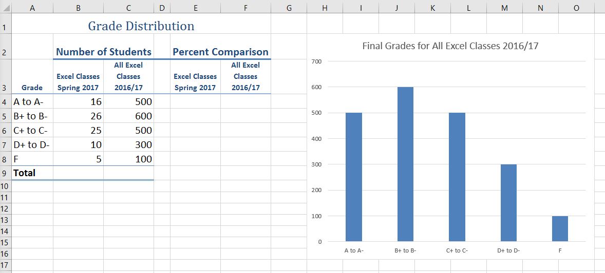
A column chart is commonly used to show trends over time, as long as the data are limited to approximately twenty points or less. A common use for column charts is frequency distributions. A frequency distribution shows the number of occurrences by established categories. For example, a common frequency distribution used in most academic institutions is a grade distribution. A grade distribution shows the number of students that achieve each level of a typical grading scale (A, A−, B+, B, etc.). The Grade Distribution worksheet contains final grades for some hypothetical Excel classes. To show the grade frequency distribution for all the Excel classes in that year, the numbers of students appear on the Y axis and the grade categories appear on the X axis. The number of students for this chart is in Column C. The labels for grades are in Column A. The following steps explain how to create this chart:
- Select the Grade Distribution worksheet in your CH4-Data_File.
- Change the years in Row3 to the current academic term and year.
- Highlight the range A3:A8 on the Grade Distribution worksheet. Column A shows the grade categories.
- Hold down the Crtl key.
- Without letting go of the Ctrl key, select C3:C8
- Click the Column button in the Charts group section on the Insert tab of the ribbon. Select the first option in the 2-D Column section, which is the Clustered Column format.
- Click and drag the chart so the upper left corner is in the middle of cell H2.
- Resize the chart so the left side is locked to the left side of Column H, the right side is locked to the right side of Column O, the top is locked to the top of Row 2, and the bottom is locked to the bottom of Row 16.
- If Excel displays a legend, delete it by clicking the legend one time and pressing the DELETE key on the keyboard. Since the chart presents only one data series, the legend is not necessary.
- Add the text Final Grades for to the chart title. The chart title should now be Final Grades for All Excel Classes 2016/2017 (or whichever academic year you are using).
- Click any cell location on the Grade Distribution worksheet to deactivate the chart.
- Save your work.
Figure 4.12 shows the completed grade frequency distribution chart. By looking at the chart, you can immediately see that the greatest number of students earned a final grade in the B+ to B− range.
Why?
Column Chart vs. Bar Chart
When using charts to show frequency distributions, the difference between a column chart and a bar chart is really a matter of preference. Both are very effective in showing frequency distributions. However, if you are showing a trend over a period of time, a column chart is preferred over a bar chart. This is because a period of time is typically shown horizontally, with the oldest date on the far left and the newest date on the far right. Therefore, the descriptive categories for the chart would have to fall on the horizontal – or category axis, which is the configuration of a column chart. On a bar chart, the descriptive categories are displayed on the vertical axis.
Creating a Chart Sheet
- Click anywhere on the Final Grades for All Excel Classes chart on the Grade Distribution worksheet.
- Right click on the chart. Select Move Chart . . . This opens the Move Chart Dialog box.
- Click the New sheet option on the Move Chart dialog box. (The top option.)
- The entry in the input box for assigning a name to the chart sheet tab should automatically be highlighted once you click the New sheet option. Type All Excel Classes. This replaces the generic name in the input box (see Figure 4.13).
- Click the OK button at the bottom of the Move Chart dialog box. This adds a new chart sheet to the workbook with the name All Excel Classes.
- Save your work.
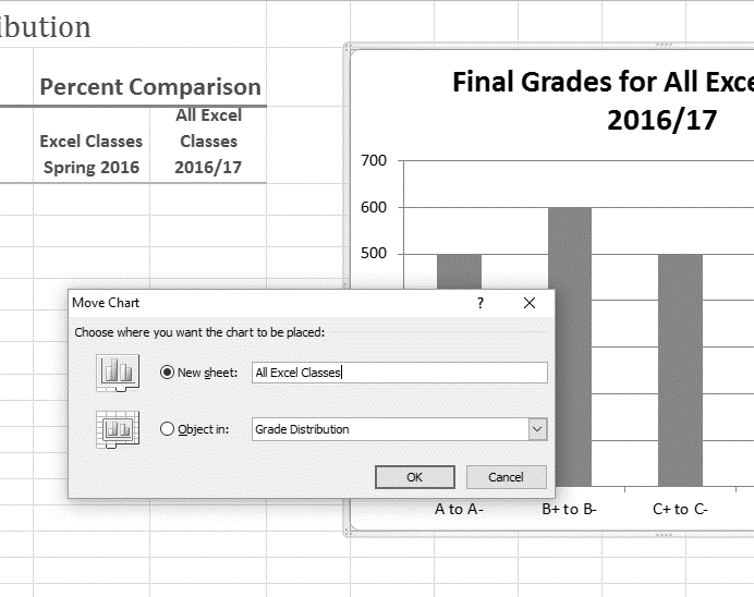
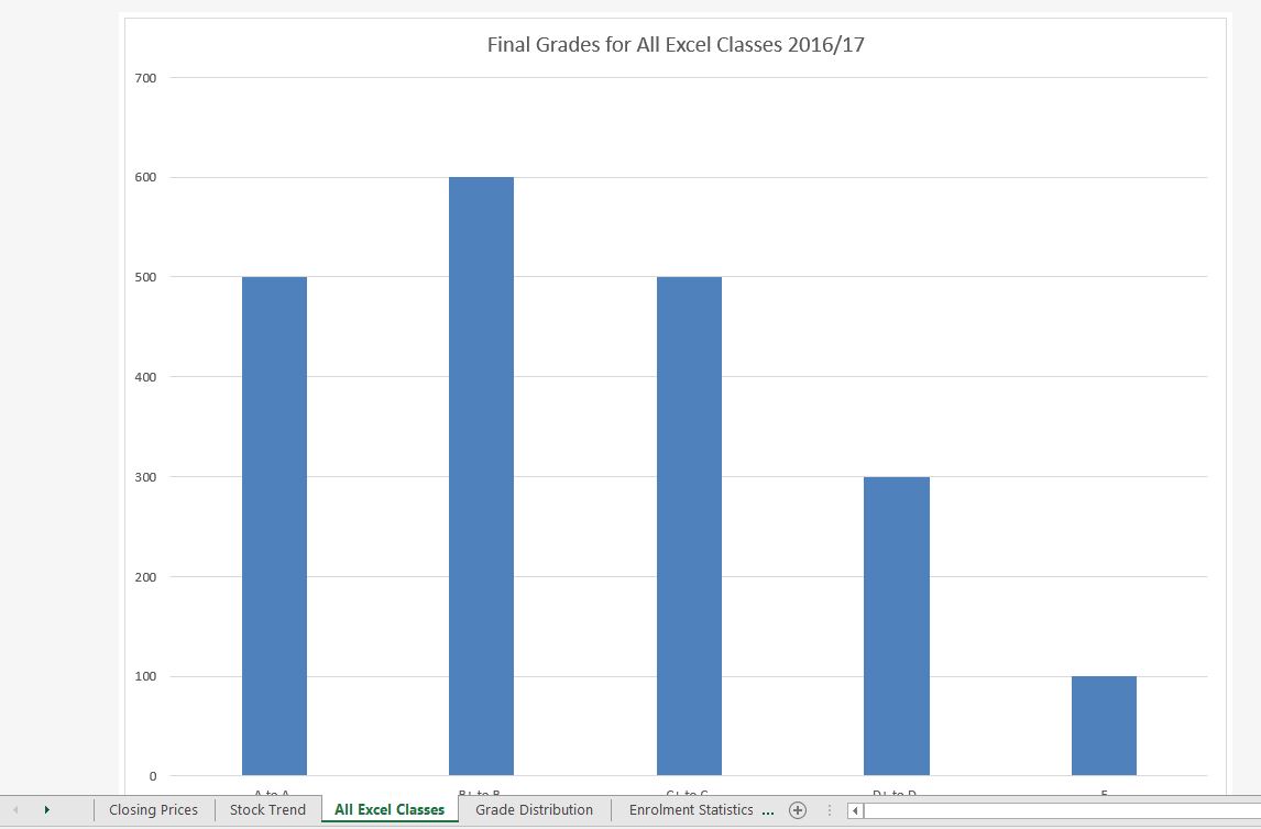
Figure 4.14 shows the Final Grades for the all the Excel Classes column chart is in a separate chart sheet. Notice the new worksheet tab added to the workbook matches the New sheet name entered into the Move Chart dialog box. Since the chart is moved to a separate chart sheet, it no longer is displayed in the Grade Distribution worksheet.
Frequency Comparison: Column Chart 2
We will create a second column chart to show a comparison between two frequency distributions. Column B on the Grade Distribution worksheet contains data showing the number of students who received grades within each category for the Spring Quarter. We will use a column chart to compare the grade distribution for Spring (Column B) with the overall grade distribution for the whole year (Column C).
However, since the number of students in the term is significantly different from the total number of students in the year, we must calculate percentages in order to make an effective comparison. The following steps explain how to calculate the percentages:
- Highlight the range B9:C9 on the Grade Distribution worksheet.
- Click the AutoSum button in the Editing group of commands on the Home tab of the ribbon. This automatically adds SUM functions that sum the values in the range B4:B8 and C4:C8.
- Activate cell E4 on the Grade Distribution worksheet.
- Enter a formula that divides the value in cell B4 by the total in cell B9. Add an absolute reference to cell B9 in the formula =B4/$B$9.
- Copy the formula in cell E4 and paste it into the range E5:E8 using the Paste command.
Or, use the Fill Handle to copy the calculation in E4 all the way down to E8. - Activate cell F4 on the Grade Distribution worksheet.
- Enter a formula that divides the value in cell C4 by the total in cell C9. Add an absolute reference to cell C9 in the formula =C4/$C$9.
- Copy the formula in cell F4 and paste it into the range F5:F8 using the Paste command.
Or, use the Fill Handle to copy the calculation in F4 all the way down to F8.
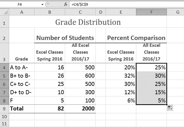
Figure 4.15 shows the completed percentages added to the Grade Distribution worksheet.
The column chart we are going to create uses the grade categories in the range A4:A8 on the X axis and the percentages in the range E4:F8 on the Y axis. This chart uses data that is not in a contiguous range, so we need to use the Ctrl key to select the ranges of cells.
- Select A3:A8, hold down the Ctrl key and select E3:F8.
- Click the Insert tab of the ribbon.
- Click the Column button in the Charts group of commands. Select the first option from the drop-down list of chart formats, which is the Clustered Column.
- Click and drag the chart so the upper left corner is in the middle of cell H2.
- Resize the chart so the left side is locked to the left side of Column H, the right side is locked to the right side of Column N, the top is locked to the top of Row 2, and the bottom is locked to the bottom of Row 16.
- Change the chart title to Grade Distribution Comparison. If you do not have a chart title, you can add one. On the Design tab, select Add Chart Element. Find the Chart Title. Select the Above Chart option from the drop-down list.
- Save your work.
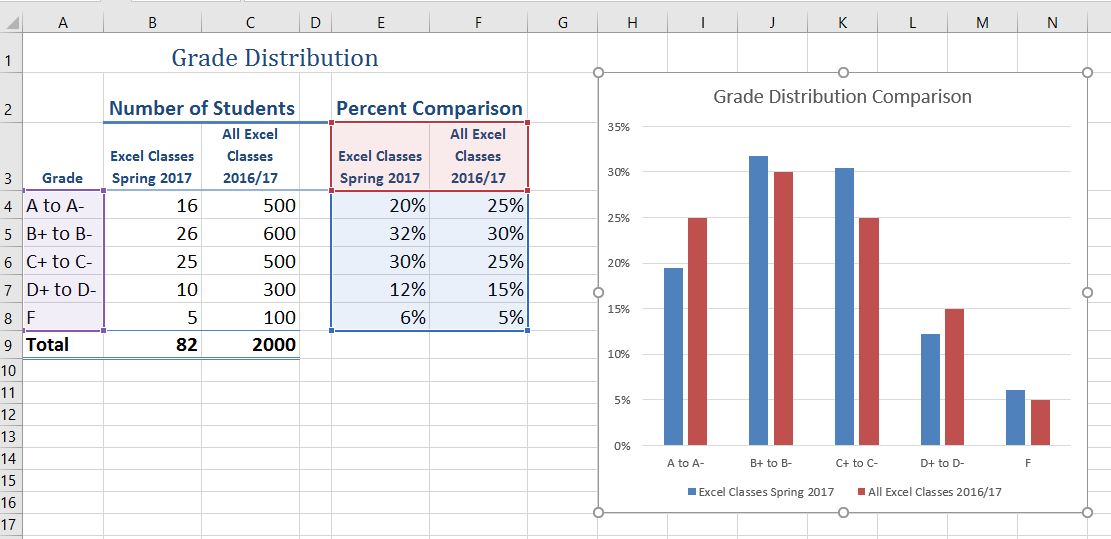
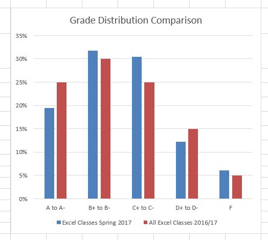
Figure 4.17 shows the final appearance of the column chart. The column chart is an appropriate type for this data because there are fewer than twenty data points and we can easily see the comparison for each category. An audience can quickly see that the class issued fewer As compared to the college. However, the class had more Bs and Cs compared with the college population.
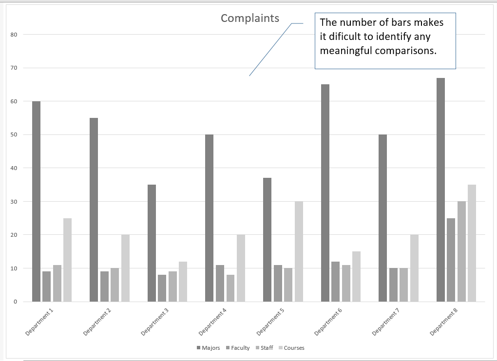
Integrity Check
Too Many Bars on a Column Chart?
Although there is no specific limit for the number of bars you should use on a column chart, a general rule of thumb is twenty bars or less. Figure 4.18 contains a total of thirty-two bars. This is considered a poor use of a column chart because it is difficult to identify meaningful trends or comparisons. The data used to create this chart might be better used in two or three different column charts, each with a distinct idea or message.
Attribution
Adapted by Noreen Brown from How to Use Microsoft Excel: The Careers in Practice Series, adapted by The Saylor Foundation without attribution as requested by the work’s original creator or licensee, and licensed under CC BY-NC-SA 3.0.
