
Excel Chapter 4 – Presenting Data with Charts
One of the most important things to consider when using charts in Excel is that they are intended to be used for communicating an idea to an audience. Your audience can be reading your charts in a written document or listening to you in a live presentation. In fact, Excel charts are often imported or pasted into Word documents or PowerPoint slides, which serve this very purpose of communicating ideas to an audience. Although there are no rules set in stone for using specific charts for certain data types, some chart types are designed to communicate certain messages better than others. This chapter explores numerous charts that can be used for a variety of purposes. In addition, we will examine formatting charts and using those charts in Word and PowerPoint documents.
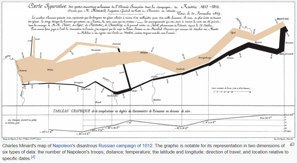
The human mind can interpret numbers (and especially larger data sets) easier that are accompanied by images that show trends and relationships that may be present in the data. The principles of data visualization, the way to present a combination of text and numbers in some type of image format go back centuries. Some of the oldest charts created in the early 19th century. William Playfair’s pie charts and Florence Nightingale’s diagrams were revolutionary means of representing numbers to tell a story. One of the highest impact data visualizations was created by Charles Minard, a French civil engineer in 1845 who made a map of Napoleon’s invasion of Russia. (Read more about his map on Edward Tufte’s website.)
“Edward Tufte is best known for his trilogy of self-published books on analytical design: The Visual Display of Quantitative Information (1983, 2001), Envisioning Information (1990) and Visual Explanations (1997). Each offers practical advice on aspects of data display and provides a spectacular array of historic and contemporary examples. Regarded as the primary authority on the presentation of information by designers, information architects, engineers, and scientists, Tufte’s work has also generated a strong mainstream interest. One million copies of these books are in print. (AIGA.org)”
Tufte on “chartjunk”
Read the following article by James Surowiecki about How Edward Tufte led Bose out of the land of chartjunk.
- What does Tufte consider chartjunk?
- What should be your goal when creating a chart?
- Do you agree with the sentiment that “design is the Big Enchilada”?
Attribution
Edited by Emese Felvégi. Adapted by Noreen Brown from How to Use Microsoft Excel: The Careers in Practice Series, adapted by The Saylor Foundation without attribution as requested by the work’s original creator or licensee, and licensed under CC BY-NC-SA 3.0.
