
6.3 PivotCharts
Learning Objectives
- Create a PivotChart.
- Sort and filter data for a PivotChart.
- Use slicers.
- Interpret an output.
CREATe A PIVOTCHART
Larger data sets make it impossible for Excel to create a basic chart or graph for you. If your data source or selection has too many cells, the recommended chart types will have no items to show, nor will you be able to select any items from the All Charts tab.
Even though we can use PivotTables to summarize large data sets, it is often helpful to use data visualization tools to give us a quick and high impact visual of our results. PivotCharts are a great way of getting an overview of general trends, comparisons, or proportions of your data in a visual format.
INSERT A PIVOTCHART
- Select any ONE cell in your range of data. (Note: Do NOT select the entire sheet, allow Excel to select the source automatically, otherwise, you may select too much data for the application to handle causing it to slow down or freeze.)
- Go to the Insert tab on the ribbon, select the ‘PivotCharts’ icon (Figure 6.3.1).
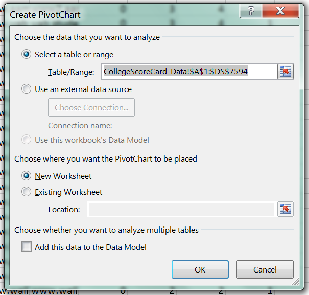
6.3.1. PivotChart in a worksheet. - A dialogue box titled ‘Create PivotCharts’ will pop-up, the Table/Range automatically populates with a selection of your data (Figure 6.3.2).
6.3.2. Create a PivotChart. - Confirm that your PivotTable will be inserted into a New Worksheet.
- Select and click ‘OK’.
- A new worksheet will be created in your workbook. Observe the blank canvas in front of you after you click OK confirming the source of your data (Figure 6.3.3). Now you have space on the left for your PivotTable, your PivotChart in the middle and your PivotChart Field including the field names and areas are in the pane on the right.
Figure 6.3.3. PivotTable, PivotChart, Fields Pane.
Once you start adding fields to your PivotChart field selector into one or more of the four possible areas (Filters, Columns, Rows, Values), your sheet will start filling in your currently blank PivotTable range and PivotChart object with summary data. Building your PivotChart works just as building your PivotTable did. Review the “Manipulating Pivot Table Fields” section in Chapter 6.1 if you need a refresher about how to add fields.
Exercises
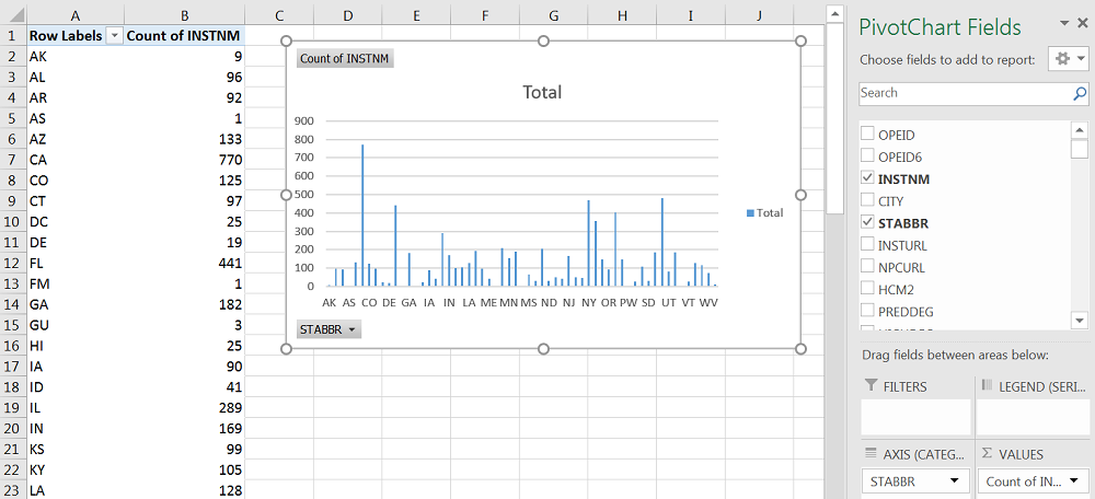
Create a PivotChart using State Abbreviations as Row Labels, the Count of Institution Names as values in a corresponding column. Your output should match Figure 6.3.4 below.
Answer the following questions:
- Is the chart easier to read than the data table?
- Is it clear from the chart which column corresponds with which state? Adjust the width of the chart to see the state names under each column.
- What type of chart is this? Click PivotChart Tools > Design > Change chart type that you have a clustered column chart.
- Are there any other chart types that would allow you to visualize this data better?
Sort and Filter a PivotChart
It can be hard to pick a good chart type even if you have summarized records for over seven thousand institutions by fifty categories in our case with the College Scorecard Data and the State Abbreviations. However, we can always sort our data to show items in a different order or show only those fields and values that meet certain criteria.
Sorting
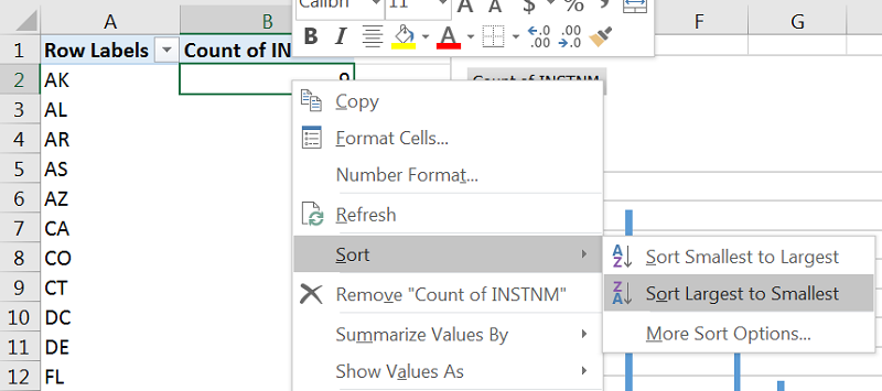
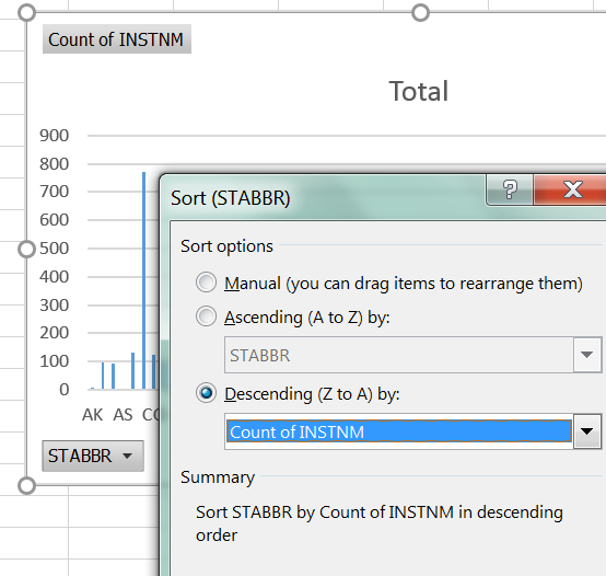
One way to make your data have a higher impact is to reorder it. Right-click the clustered column chart you created in the earlier section of this chapter and sort the Count of INSTNM column in descending order (from Largest to Smallest). The easiest way to do this is how we have done so in Chapter 6.2, by right-clicking on the column of data that you wish to sort by and hovering over the sort tab and selecting how you wish to sort (Figure 6.3.5A).
You can also sort by clicking the STABBR dropdown in the lower right corner of the PivotChart. In the dialogue box that pops up, adjust the Sort Options to sort in Descending order by Count of INSTNM (Figure 6.3.5B).
Observe how the output now has a clean line from highest to lowest values from left to right (Figure 6.3.6) instead of what may be a confusing zig-zag of values all around when using the alphabetical order of states.
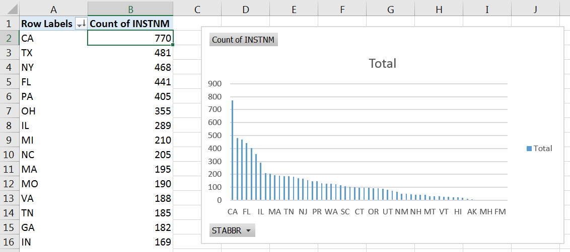
Furthermore, when you look at the PivotChart, you may notice that there are groups of columns with somewhat similar values followed by other groups with much lower, but still similar to one another.
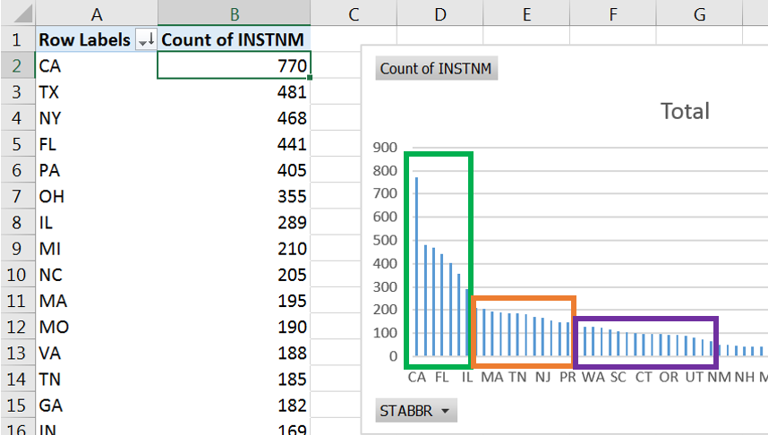
Even a cursory glance at the PivotChart allows us to see patterns much faster in our data than if we observed the changes in the numerical values. We can use the visible drops or changes in values across to go back to our groups and narrow down our inquiry to a smaller subset of our data (Figure 6.3.7).
While we can make the width of our PivotChart take up our entire screen; but it may still be hard to see which value belongs with which state depending on your screen size or resolution. At this point, it would make sense for us to focus on a subset of our data by filtering it.
Filtering
Focusing on a subset of your data allows you to examine a smaller group of items in detail. It is good practice to start any report by an overall description of your data points, noting general trends in your data, and the sorting allowed you to do that. However, filtering will let you zoom in on items you may want to highlight.
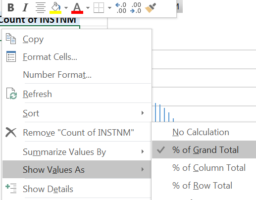
From the clustered column PivotChart and the corresponding data table we can see that there are five to seven states that have a high number of colleges. Convert the Count of Institutions to show as Percentages of Grand Total (Figure 6.3.8), then add up the values you find.
These quick steps will reveal that one-third of institutions are in five states at the top of our list (CA, TX, NY, FL, PA), with over forty percent of institutions in the top seven states (add OH and IL). There are differences within this group too, therefore, we want to find a chart type that would highlight his.
Convert the clustered column PivotChart into a Pie to show contributions to the highest volume group.
Right-click the PivotChart > Change Chart Type OR Go to Design > Change Chart Type. Your output will show all the states with the legend on the right having space for the states with the highest values (Figure 6.3.9).
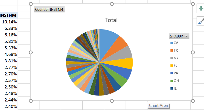
We could make our chart area much bigger to show all the states, but then it would be a huge color wheel on our screen and we would have a hard time identifying which slice is which state, even if we added callouts.
Exercises
Filter your Pie chart to show CA, TX, NY, FL, PA.
Add Inside End Data Labels to show the State name and percentages on the slices of the pie.
Which college or colleges stand out and which colleges have a roughly similar portion among the top five?
What would be a fitting title for this chart?
use Slicers
In Chapter 5 and earlier in Chapter 6, we looked at using slicers as another way of filtering data. A slicer is an object we can insert next to our data and use buttons to select items we wish to filter for (or filter out) of our data. Let us try using the Slicer to filter a PivotChart by LOCALE, then by the value in the Count of Institutions column:
- Insert a PivotChart that uses State Abbreviations as Rows, the number of Institutions as Values (Count, not SUM).
- Go to PivotTable Tools > Analyze > Insert Slicer.
- Select LOCALE from the field names by clicking its checkbox.
- Filter your data for all types of Cities by using your slicer by clicking the corresponding codes (11, 12, 13) under the LOCALE heading in your slicer. Use SHIFT to select multiple adjacent items.
- Add another filter from the PivotChart’s STABBR filter dropdown and match the selections from the dialogue box below (6.3.10).
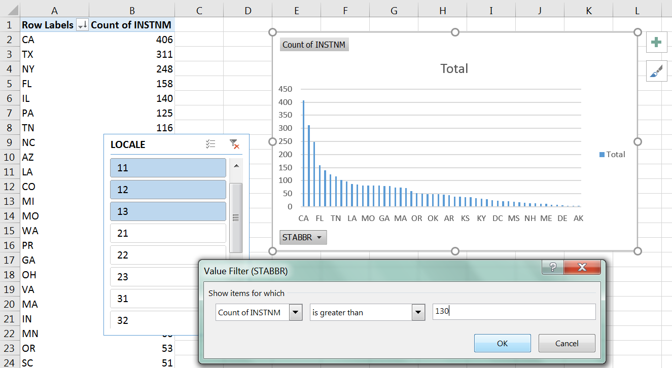
Figure 6.3.10. PivotChart with slicer and an additional filter. - Match your output to what is shown for the Exercise below.
Exercises – Interpret an Output
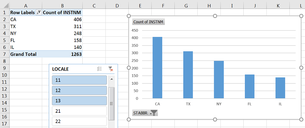
The figure above (Figure 6.3.11) shows the output of the previous section.
Change the values to show as Percentages of the Grand Total.
Is there a change from the previous filtering of the data set by LOCALE for each state?
What would be a good title for this chart?
Attribution
“6.3 PivotCharts” by Emese Felvegi is licensed under CC BY 4.0
