
6.2 Sort & Filter PivotTable Data
Learning Objectives
- Sort and filter data in a PivotTable.
- Manipulate Value Field Settings.
- Use slicers.
- Interpret outputs.
In the previous part of this chapter, we learned how to create a PivotTable from a range of data and enable Fields to output useful information. In this part, we will be diving deeper into how to make the most of this data and learning how to manipulate the output in various ways to get more and more impactful information.
By placing the “STABBR” Field in the Rows Area of the Pivot Table Fields Tab, we were able to get a list of all unique State abbreviations in the STABBR column. Subsequently, by placing the “INSTNM” Field in the Value Area of the PivotTable Fields Tab, we were able to derive the number of institutions in each State. Using these two Fields in conjunction, we can see valuable information not easily derived from a large data-set. (Consider much faster using a PivotTable is than using an Excel Table and Subtotals.)
Sort and Filter Data in a PivotTable
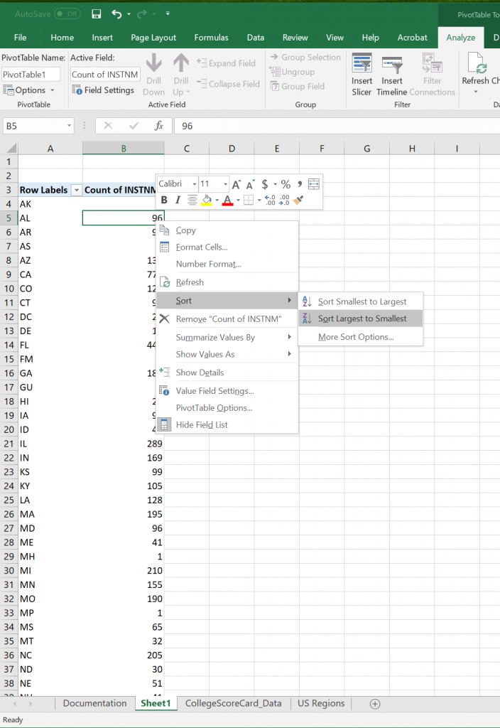
Like with normal Excel Tables, PivotTables share the ability to sort data in columns. We can use this function to easily visualize information from smallest to largest or in alphabetical order (in ascending or descending order based on number, dates, or text). The easiest way to do this is shown in Figure 6.8: by right-clicking on the column of data that you wish to sort by and hovering over the sort tab and selecting how you wish to sort.
Filtering
There are instances in which we will not want to see the results of the entire data-set at one time. In these cases, we are usually looking for information restricted by one or more variables to see how the information changes with those variables. For now, try for yourself to see how the PivotTable changes when you add a Field to the Filters Area.
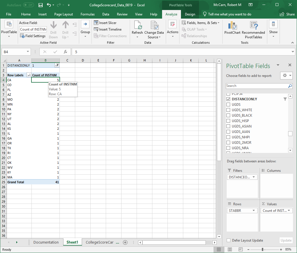
Start by dragging the Field “DISTANCEONLY” into the Filters Field. At the top of the PivotTable, you will see a new box with a dropdown menu that says “(All)”. This means that no data is being restricted yet. Click on the downward facing arrow and look at the parameters it shows you. You should see (All), 1, 0, and NULL. (All) is the current selection of every option the column contains. NULL is an indicator that Excel uses to state that there is no information in a cell – Sometimes in large datasets the creators do not or cannot collect any relevant information. In such cases, they show they have made an attempt and have come up with a value that would translate to Not Applicable or Unavailable rather than leave that entry blank. For meanings of 1 and 0 refer to the Data Dictionary or last Chapter Part for the definition of a Boolean.
Key Takeaways
1 – A Boolean parameter meaning TRUE
0 – A Boolean parameter meaning FALSE
- DISTANCEONLY: Set the Filter to only display TRUE values. This means that ONLY institutions classified as a Distance Only institutions will be displayed. You will see that this drastically changes the output of the Pivot Table.
Remove the “DISTANCEONLY” Field from the Filter Area by dragging it out of the box or clicking the arrow beside the Field and selecting “Delete Field”. This will reset the Pivot Table to the previous state. Now change the Field to the Fields listed below.
- HIGHDEG: The Filter values for this Field list 0-4. See the Data Dictionary for the meanings of each value. We will be looking at ‘4’ or the highest degree offered an institution is a Graduate Degree.

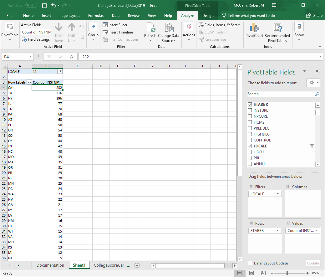
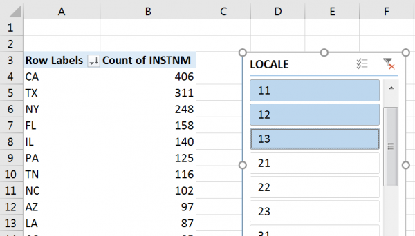
- LOCALE: This Field in an encoded field, so you will need to know the meanings of the values before interpreting the information. See the chart in the Data Dictionary for a detailed description. For now, we are looking at ‘11’ or Large Cities.
As you can see, by restricting the number of results to a given parameter, we can get more information out of this data than by just looking at a raw table. However, in each of these examples, we have consistently been looking at the number of institutions broken down by state. The ROW and VALUE fields have not changed in any of these examples. Take a moment and change the VALUE field to “SAT_AVG” or “MD_EARN_WNE_P10”. How does this impact the output of the PivotTable? What other ways can you manipulate the Fields shown to get a different set of information? The great impact of a PivotTable comes from its flexibility to show data summarized in many various ways.
Using Slicers
In Chapter 5, we looked at using slicers as another way of filtering data. A slicer is an object we can insert next to our data and use buttons to select items we wish to filter for (or filter out) of our data. Let’s try using the Slicer to filter our PivotTable by LOCALE:
- Insert a PivotTable that uses State Abbreviations as Rows, the number of Institutions as Values.
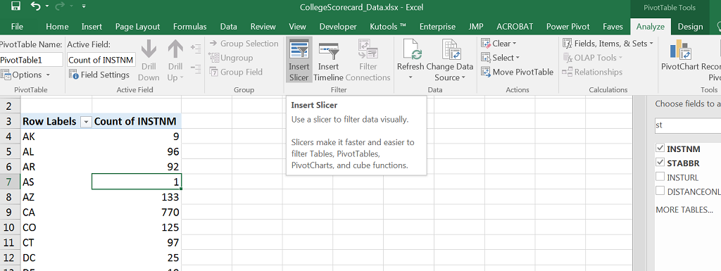
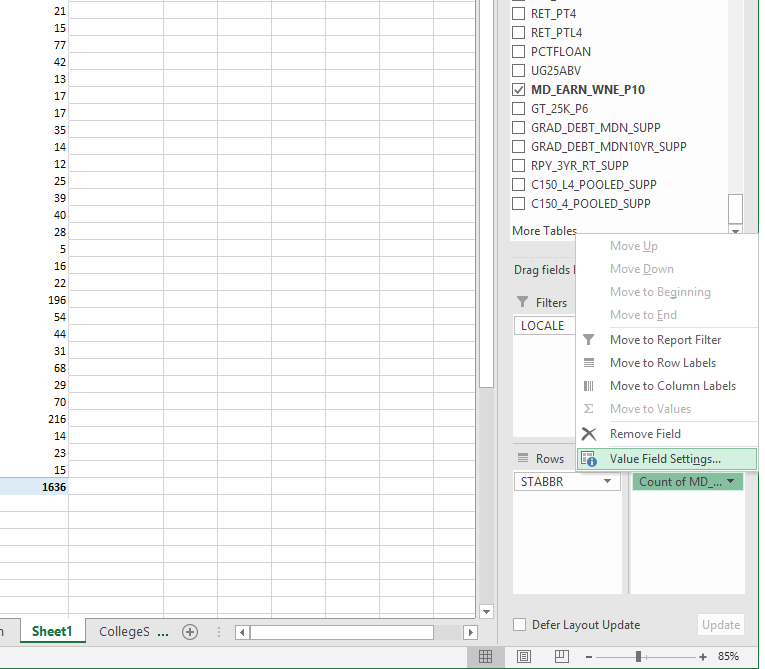
- Go to PivotTable Tools > Analyze > Insert Slicer (Figure 6.12).
- Select Locale from the field names by clicking its checkbox.
- Filter your data for all types of Cities by using your slicer by clicking the corresponding codes under the LOCALE heading in your slicer. Use SHIFT to select multiple adjacent items. (Figure 6.13).
- Adjust the width, height, or color of your slicer to as you like using the Slicer Tools > Options tab when the Slicer is active.
Whether you use a slicer side by side with your data table or filter your data via the Filter area in the PivotTable field selector, the result is the same. You can use slicers with charts, Excel tables, and PivotTables. You can clear them to show all of your data once you are done with your analyses. Helpful hint: If you process data using a PivotTable, it’s best to save your output as a new sheet and start a new process in a new sheet. This way you can conserve your outputs and revisit them later as needed.
Exercises
Take a minute and try to answer the following questions by changing the Fields in the ROW, FILTER, and VALUE areas.
- How many institutions in Midsize cities in the State of North Dakota have a Graduate Program? How about California? What can you infer from this information?
- What are the median earnings of former students of institutions located in Remote Towns? How about Large Cities? What can you infer from this information?
Manipulate value field settings
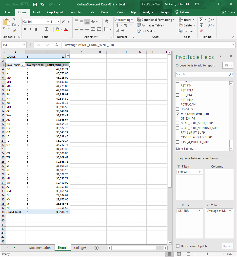
If you tried to answer question number 2 above and were left confused, don’t worry. Excel will often summarize the Field you drag into the Values Area as a function that you might not want. In this case we are looking at the median earnings of former students in all institutions, so we do not want a COUNT of all values, as that will return the same information as if we did a COUNT of all institution names. No, in this case, an AVERAGE would better summarize our data and give us something to analyze. To do that we must change the Value Field Settings.
- Start by right-clicking the Field in the Values Area – it should say COUNT of INSTNM currently.
- Click on the icon at the bottom where it says Value Field Setting… Figure 6.14
- Underneath where it says Summarize value field by, you will see a list of functions to apply to the Field.
- Select AVERAGE from that list. Figure 6.15
- Click OK.
After you apply the Value Field Setting, the Pivot Table will change from a COUNT of the Field, to an Average of the Field, returning different summary information. Figure 6.16


From here you can make the information easier to visualize.
- Right click on the Average of column.
- Select Sort.
- Click Sort Largest to Smallest
- Select all Values in Column B
- Change the Number Style from General to Currency. Figure 6.17
Displaying as Percentages
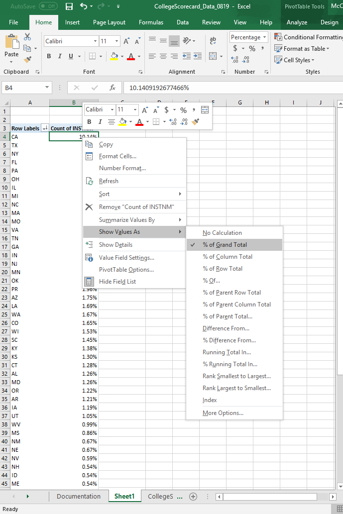
Another way to visualize information is to see the value of each column as a percentage of the total. The easiest way to ask yourself this is “What percentage of all institutions in the United States are those in Texas?” To do this we need to reset our Pivot Table.
- Remove the Fields from Filters and Values. Leaving only “STABBR” in Rows.
- Insert “INSTNM” into the Values Area. It should display as COUNT of INSTNM
Now we have the number of institutions in each State and we have the Grand Total of all institutions in the United States, sure we could do some simple math to figure our question out, but what if we wanted to know the percentage for every State?
- Right click the Count of INSTNM column.
- Select Show Values as.
- Click on % of Grand Total. Figure 6.18
- Right click on Count of INSTNM column
- Select Sort
- Click on Sort Largest to Smallest
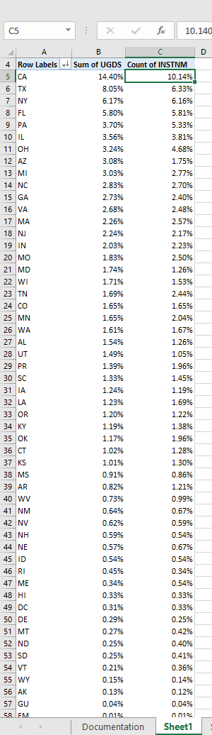
You will see that the answer to our question is “Texas has 6.33% of all institutions in the United States”.
interpret outputs
Exercises
What percentage of the total number of undergraduate students AND what percentage of the total number of institutions does the state of California have? How does this compare to the state of Oklahoma?
Attribution
“6.2 Sort & Filter Data” by Robert McCarn is licensed under CC BY 4.0
