
5.4 – Practice 1: YouTube Top 30
Learning Objectives
- Recognize and explain table structure.
- Freeze rows and columns.
- Sort data in a table.
- Interpret Excel Table outputs.
In this chapter, we are going to look at the Top 30 most-watched YouTube videos and how we can play with their data to practice using features in Excel.
YouTube is an online video-sharing platform with 28.8 billion dollars in revenue for Alphabet in 2021. YouTube allows users to upload content and monetize it, with $3-6 paid out to content creators for every 1,000 impressions, so it is a viable source of revenue for musicians, entertainers, or anyone with content people may find interesting.
The source of our data is the top 30 list available on Wikipedia that we can paste into an Excel sheet for a quick start. Generally, a simple copy-paste method is a really simple way of creating opportunities for us to work with data before we get into using larger open data sets from U.S. government entities or data that someone has already pre-processed and shared online. We have added a few extra fields to the original table to have more numbers to use for calculations as part of this practice, so you will find the Number of Likes and Number of Comments added. Note that made for children have comments turned off as explained by this article from the BBC YouTube bans comments on all videos of children from 2019.
Download the YouTube Top 30 Chapter Practice data file to your computer and open it. Be sure to save a copy of the file for your records with your initials or last name so that you have a clean, unedited copy in case you need to return to that.
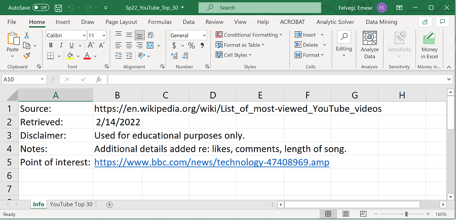
Observe the “Info” sheet that has some key points about the data, such as its source, when it was downloaded, what types of edits were made to it. Consider how communicating key facts about your data to your colleagues is an important form of consideration and civility when it comes to workplace collaboration. These types of notes also help you recall what types of tasks you may have done as you prepared an analysis or report.
Click into the YouTube Top 30 sheet in your workbook and observe the range of data you will be working with. You have text, dates, and numbers stored in this sheet. This is a very small data set, but it’s already large enough so that you can’t easily see trends or patterns in it. Once you have processed the data a bit, you may want to revisit Chapter 3 for Conditional Formatting options or Chapter 4 for adding charts of graphs for more comprehensive analyses.
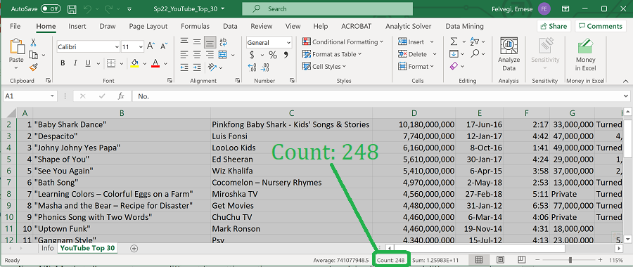
In this practice, you will use an Excel Table that allows you to access different formatting options, a new way of applying functions, and different ways of changing what we see from our data. You will start by inserting an Excel Table based on the range that goes from A1 through H31. If you look in the lower right corner of your screen, the status bar will show you that there are 248 pieces of data in this particular range. That is not a lot of data but it is a good example of a structured data set. Structured data essentially means that someone has gone to the trouble of organizing data in meaningful ways to represent related types of content by categories.
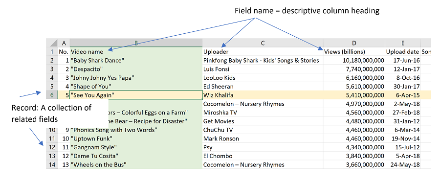
Highlighted in green below is a column, in yellow a row. In this range, each column heading has a name, each of these names represents a category, and the term we use to describe these is field name. Every field name in this Excel Table structure represents one type of data. Every row that we have in this Excel Table represents one video and each of those fields in the header of the table, the topmost row of it, comes together to give us the record of that particular video, a collection of data in all fields related to that video.
Fields and records are terms that are commonly used in databases (a collection of related data sets) that you may encounter in all lines of work.
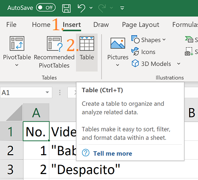
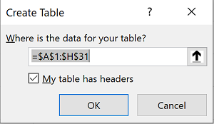
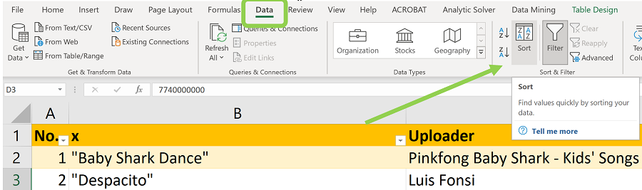
You can create an Excel Table by clicking into cell A1, then click the Insert tab on the ribbon and by selecting the Table option or by pressing the key combination CTRL+T (CMD+T on a Mac). NEVER select the entire sheet as that can potentially crash your application: remember that Excel has over 16,000 columns and over a million rows and selecting all of that may well be too much for your computer.
Next, Excel is going to ask you in a dialogue box Where is the data for your Table? The good news for you is that Excel recognizes that you have a range of data from cell A1 through cell H31. Note how the reference is shown as an absolute: =$A$1:$H$31. This means that if you copy your Table elsewhere, as we copied charts in the previous chapter, your source will always remain the same, no matter where you copy the Table. Excel is also asking you if your table has headers so it is asking me if you want to use what is in row 1 above each of those columns to be the category label, the header for that particular Table. You will want to use these because these are the field names you use as part of your data structure.
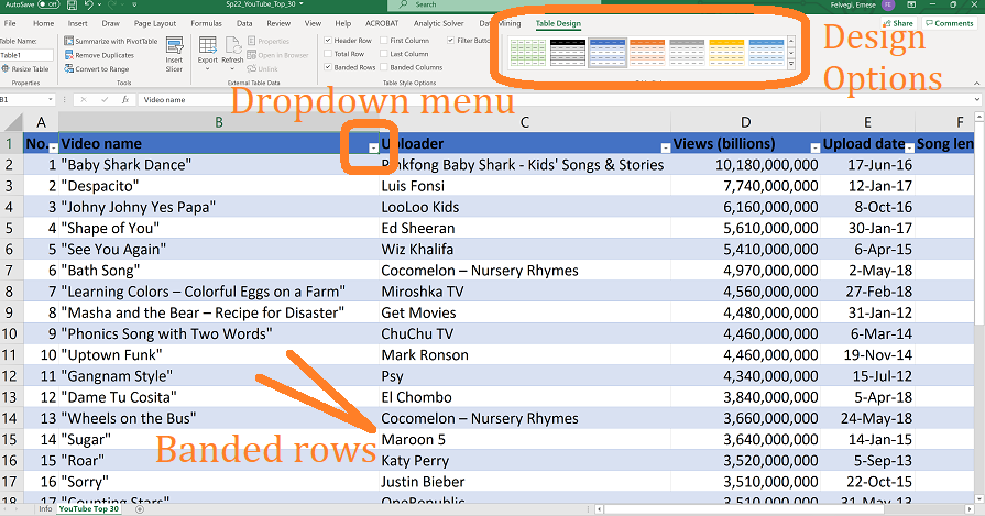
After you click OK, Excel will automatically format in the default Table Style which you may want to change to something where it’s easier to read the column headings. Your data immediately looks different from a simple Excel range as it became editable through the Table Design features that pop up on the ribbon. You now have access to all sorts of table styles without having to manually format things. More than that, you have what are called banded rows that switch colors to help you easily differentiate between content elements.
SORTING YOUR DATA
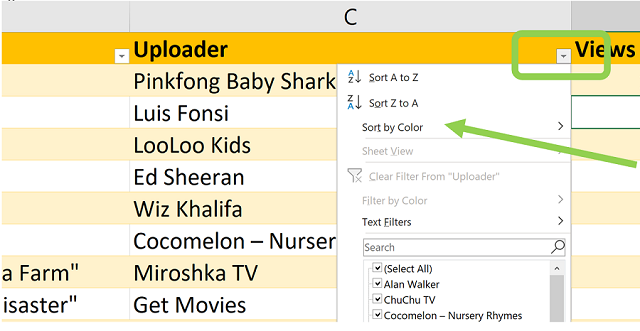
Right there from the header row, you get access to Sort and Filter options that allow you to quickly rearrange the data in that Table so you can quickly sort in alphabetical, numeric, or in time order using ascending or descending order. Observe how next to the field name the little drop-down arrow is going to have an additional symbol indicating if contents have been sorted in ascending or descending order.
Sorting is essentially reordering things in ascending or descending order to have an alphabetical, numerical, or time order or by color without any change in how many rows are displayed altogether. I can sort directly from the table as shown below by clicking on the dropdown next to the field name.
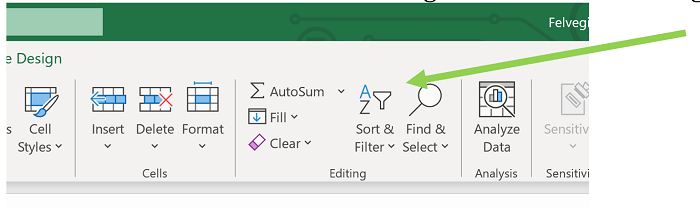
I can also sort from the ribbon using the icon in the Editing tab:
I can also sort data from the Data tab as well:
Practice putting the videos in order by Uploader alphabetically, by Song length from shortest to longest, or by Upload date from oldest to newest.
filter your data
Think about the difference between the meaning of words sort and filter. Sorting generally means organizing by some type of order. Filtering generally means removing items we don’t need. With our data set, when we sort, will always have 30 videos shown. However, if I only want to see videos that were uploaded between 2010 and 2015, I can go ahead and filter my data and select only those items that meet my criteria and were uploaded during those five years. Use the same method for filtering that you did for sorting: directly from the table header row, the Editing tab on Home or Sort & Filter under the Data tab.
When I filter in Excel, the application will hide everything that does not meet my criteria. This means that in example, everything that was not uploaded between 2010 and 2015, Excel is going to filter out.
Click the dropdown next to the “Upload date” field name.
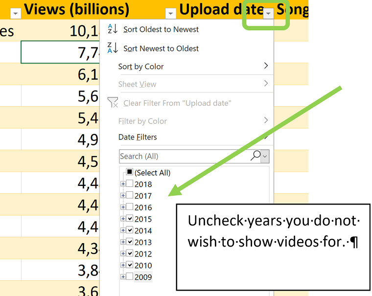
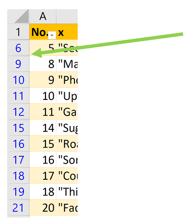
After you click OK, look at the left-hand side of your screen to observe the row numbers in Excel. Note that the numbers will go from 1 to 6, 9, 10, 11, 12, 15, etc. There are rows skipped in the numbering, which means that Excel hid data as I filtered things out.
Practice using filters some more! Show only videos from 2015-2020. Show song from before 2010. Are there any? How many are there? How do the row numbers change?
In between applying filters, you may want to go ahead and Clear existing filters from your data to avoid “overfiltering”. There is such a thing as too many filters: you may get 0 outputs in a table if you use too many conflicting filters. Getting no outputs may also mean that there are no matching items for your search, your parameters make it impossible for you to find an answer. When this happens, just remove some of them and see if that changes something.
![]()
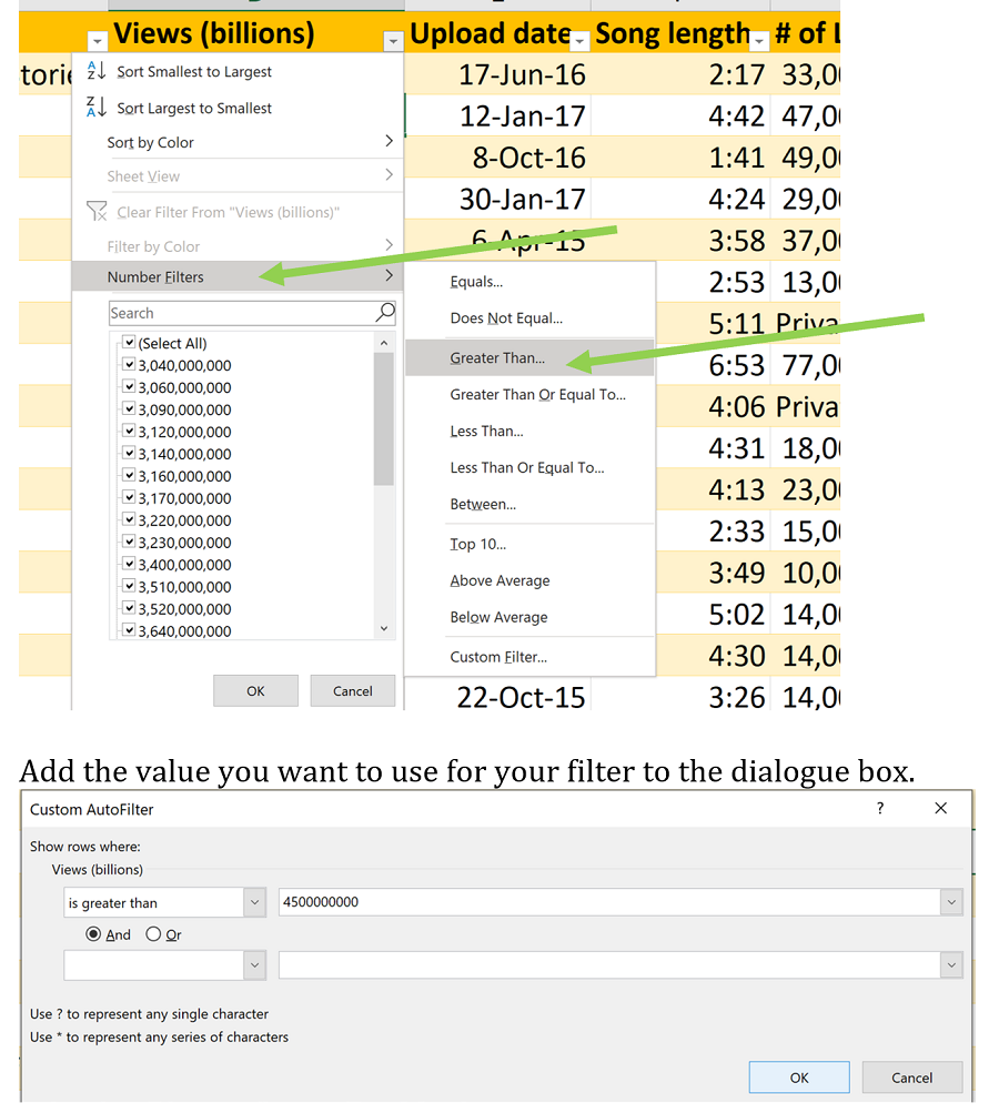
Next, we will use more specific numeric value ranges to set criteria for filtering.
For instance, if I only want to see videos that have over 4 billion views then I can apply a number filter to show only those items that meet this criterion. Add the value you want to use for your filter to the dialogue box. Your output will show only the videos that met your criteria. This may not be as impressive with 30 videos than when you have 30,000 or 300,000 records, but it’s a good way to see how effective this simple feature can be!
Practice adding more values to the filters and see how your table is rearranged after that!
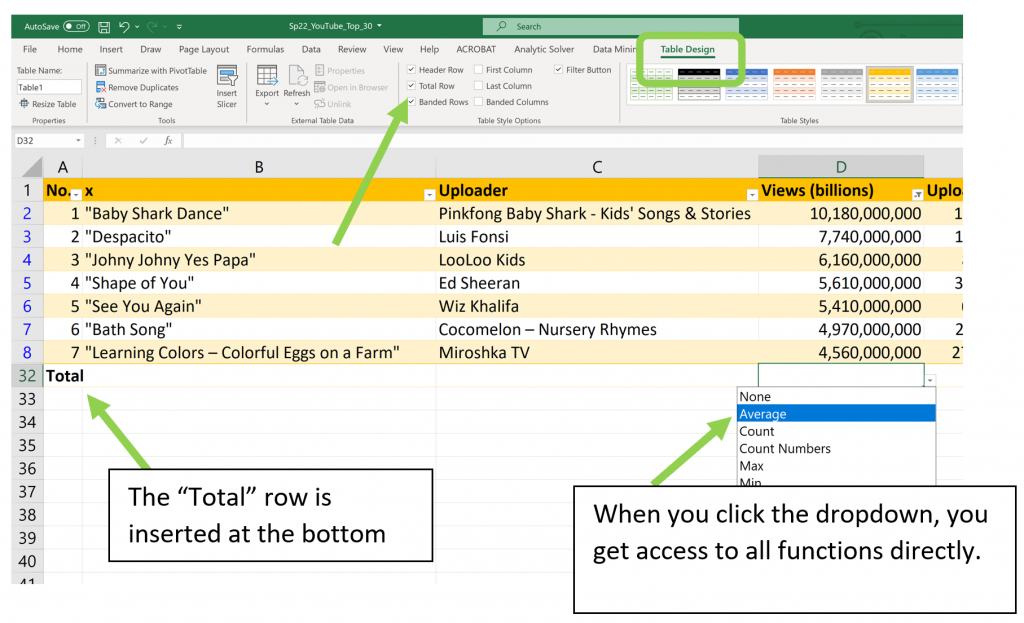
the total row
Now that we have looked at sorting and filtering data using the header row and the field names, we are moving on to using a feature called the Total Row.
In the past few chapters, we calculated values and used functions and formulas to do so. We can certainly do that in an Excel table as well, but if I try to put in a SUM function at the bottom of my table, even though I put in a range reference from D2 through D31, Excel automatically converts that over to =SUM(Table1[Views])
While Excel will still recognize my cell referencing, it now looks at data from a higher perspective. It’s no longer looking at it at the cell level, it’s looking at a table at a column level.
This tells me that I can now do things to this table that will allow me to communicate to my non-Excel user colleagues (or really anyone) what I’m doing a little bit better and faster! If you think about it, SUM of [Views] is more descriptive than SUM of D2:D31, correct?
I can certainly do a manual formula here, but a faster option for me to do if I’m dealing with an Excel table is to use a feature called the Total Row.
Click anywhere in the table and then go to the Table Design contextual tab that pops up on the ribbon. In Table Design, check the Total Row box or press CTRL+SHIFT+T (On a Mac, press CMD+SHIFT+T.
When I click into each cell on the Total Row, I see a drop-down list show up. When I click the drop-down, I don’t even have to type in a function for Excel to do my work for me! I can just click the SUM or AVERAGE function and I can say that the top 30 most viewed videos on YouTube have over 125 billion views. On average the top 30 has 4.1 billion views. Then the highest (MAX) is 10.18 billion and the lowest (MIN) is about 3 billion.
This Total Row allows me to create, insert and use functions, in a more robust way. If I go ahead and filter my data, then the Total Row output is going to update my SUM or AVERAGE values automatically. What a great time saver!
Go ahead, average the song length, number of likes, the number of comments. In between clear filters and see how the outputs change!
