
5.1 Table Basics
Learning Objectives
- Recognize and explain table structure.
- Plan, create, and edit a table.
- Freeze rows and columns.
- Sort data in a table.
- Interpret Excel Table outputs.
This section reviews the fundamental skills for setting up and maintaining an Excel table. The objective used for this chapter is the construction of a multi-sheet file to keep track of two cities’ national weather data for the month of January. Organizing, maintaining, and reporting data are essentials skills for employees in most industries.
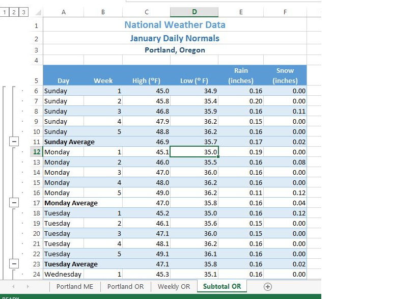
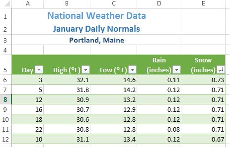
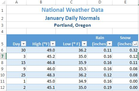
Figure 5.1 shows the completed workbook that will be demonstrated in this chapter. Notice that this workbook contains three worksheets. The first worksheet lists average weather for January in Portland, Maine. The second sheet lists average weather data for January in a very different climate – Portland, Oregon. The third sheet adds a weekly column to the Portland, Oregon data so that it can be subtotaled by week.
Download Data file: CH5 Data
Creating a Table
When data is presented in long lists or columns, it helps if the table is set up well. Here are some rules of data-entry etiquette to follow when creating a table from scratch:
- Whenever you can, organize your information using adjacent (neighboring) columns and rows.
- Start the table in the upper-left corner of the worksheet and work your way down the sheet.
- Don’t skip columns and rows just to “space out” the information. (To place white space between information in adjacent columns and rows, you can widen columns, heighten rows, and change the alignment.)
- Reserve a single column at the left edge of the table for the table’s row headings or identifying information.
- Reserve a single row at the top of the table for the table’s column headings.
- If your table requires a title, put the title in the row(s) above the column headings.
Following these rules will help insure that the sorts, filters, totals, and subtotals you apply to your table with give you the desired results.
With these rules in mind, we will begin working on the Portland ME worksheet in the National Weather workbook. Notice that the data is in adjacent columns and rows. The upper-left corner of the table is in A5 and the titles are above the column headings in Row 5. Since the set-up of our data looks good, we are ready to turn our data range into an Excel table:
- Open data file CH5 Data and save a file to your computer as CH5 National Weather.
- Click on A5 in the Portland ME sheet.
- Click the Table button in the Insert tab of the Ribbon.
Figure 5.2 will appear on your screen.
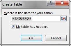
- Make sure “My table has headers” is checked. Click OK.
- Click in A5 again.
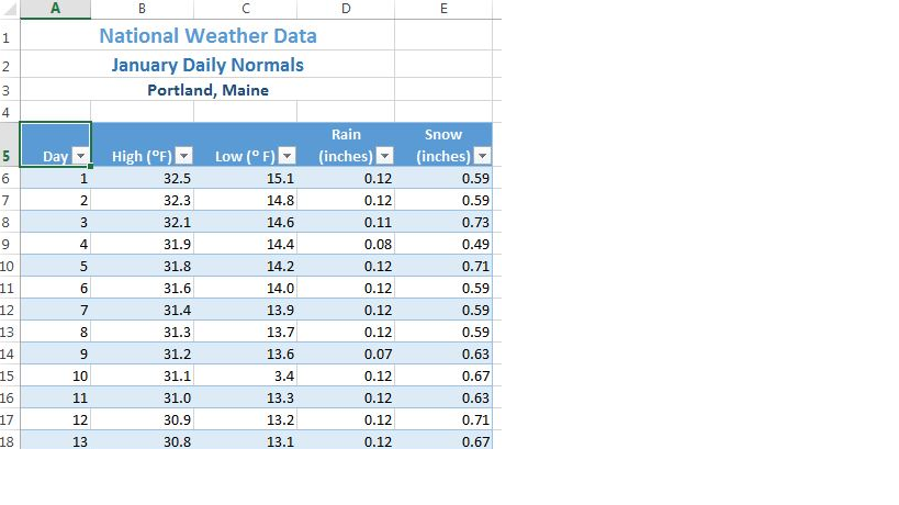
- Adjust your columns widths so that you can see the complete headings in row 5 with the filter arrows showing. The filter arrows are the down-arrow buttons that will appear in row 5 when you create your table. We will learn how to use these to sort and filter later in this chapter.
After this, your spreadsheet will look like Figure 5.3.
Notice that a new ribbon tab, Table Tools Design, appears when you click inside your table. This ribbon tab allows you to edit, style, and add functionality to your table.
Let’s try these steps again in the following steps:
- Click on the Portland OR sheet and click in cell A5.
- Click the Table button in the Insert tab of the Ribbon.
- Make sure “My table has headers” is checked. Click OK.
- Click in A5 again.
- Adjust your columns widths so that you can see the complete headings in row 5 with the filter arrows showing.
Skill Refresher
Create a Table
- Click on the top left cell in your data.
- Click the Table button in the Insert tab of the Ribbon.
- Make sure “My table has headers” is checked. Click OK.
- Click on the top left cell again.
- Adjust your columns widths so that you can see the complete headings with the filter arrows showing.
Formatting Tables
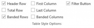
There are many ways to format an Excel table. There are preset colored Table Styles with Light, Medium, and Dark colors. There are also a variety of Table Style Options listed in Table 5.1.
Table 5.1 Table Style Options
| Table Style | Description |
| Header Row | Top row of the table that includes column headings |
| Total Row | Row added to the bottom that applies column summary calculations |
| First Column | Formatting added to the left-most column in the table |
| Last Column | Formatting added to the right-most column in the table |
| Banded Rows | Alternating rows of color added to make it easier to see rows of data |
| Banded Columns | Alternating columns of color added to make it easier to see columns of data |
| Filter Button | Button that appear at the top of each column that lists options for sorting and filtering |
We’ll add some formatting to both of our Portland weather tables in the following steps:
1. Click on the Portland ME sheet in your file.
2. In the Table Tools Design tab, in the Table Styles group, click the More button. 
A gallery of table styles will appear as in Figure 5.4.
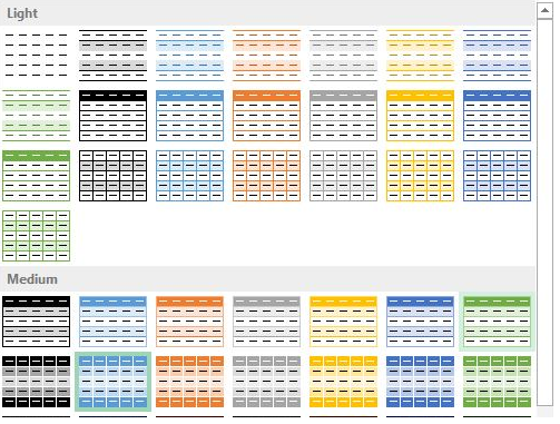
3. In the Table Styles gallery, in the Medium Section, click Table Style Medium 7.
4. In the Table Style Options group in the Ribbon, click Banded Rows.
The alternating colored rows will disappear. The data in the table is now more difficult to read.
5. Try out some of the other options in the Table Style Options group. Once you’re finished, check just Header Row, Banded Rows, and Filter Button as in Figure 5.5 below.
Adding Data to Tables
Over time, you will need to add new data to an Excel table. You will add the data to the table in a blank row. The easiest way to do this is to enter the data in the first blank row below the last row in the table. You can then rearrange the data in the table by sorting it. If you need to add data in a specific place in the middle of a table, you can insert a blank row in the middle and add your data there.
We need to add the last three days of the months to both our Portland, Maine and Portland, Oregon tables. The following steps will walk you through doing this.
- Click on the Portland ME worksheet.
- Click on A34 (the left-most cell below the last row in the table).
- Enter the following data:
Table 5.2 Portland, Maine data
| Day | High (°F) | Low (°F) | Rain (inches) |
Snow (inches) |
| 29 | 31.4 | 13.3 | 0.12 | 0.59 |
| 30 | 31.6 | 3.4 | 0.08 | 0.47 |
| 31 | 31.7 | 13.5 | 0.12 | 0.63 |
Notice that the banded row formatting continues as additional rows are added to the tables.
- Click on the Portland OR worksheet.
- Click on A34 (the left-most cell below the last row in the table).
- Enter the following data:
Table 5.3 Portland, Oregon data
| Day | High (°F) | Low (°F) | Rain (inches) |
Snow (inches) |
| 29 | 48.8 | 36.2 | 0.16 | 0 |
| 30 | 49.0 | 36.2 | 0.11 | 0.32 |
| 31 | 49.1 | 36.1 | 0.16 | 0 |
Finding and Editing Data
It is inevitable that you will find data errors in your table and need to correct them. While you can visually scan through a table to find your errors, this can be a tedious and tiresome process. Excel can help with this through the Find command. When you use Find, the best practice is to start at the top of the table to ensure that all your data is included in the search.
We know that a temperature of 3.4 degrees (brrr!) was entered erroneously in the Portland Maine sheet. It should have been 13.4. To fix this error, complete the following steps.
- Click on the Portland ME sheet.
- Press the CTRL+HOME keys together to go to the top of the sheet (A1).
- In the Home tab of the ribbon, click on Find & Select in the Editing Group and then click Find.
- In the Find box, type 3.4, and then click Find Next.
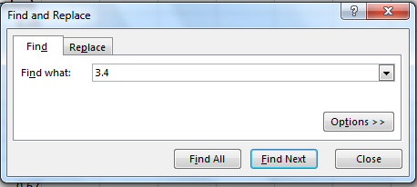 Figure 5.6 Find and Replace
 - Click the Close button.
- Replace 3.4 in the Low column for Day 10 with 13.4.
- Now switch to the Portland Oregon sheet and find the Snow error of .32. Change it to 0.12. You should find the error in Day 3.
Skill Refresher
Finding and Replacing Data
- In the Home tab of the ribbon, click on Find & Select in the Editing Group and then click Find.
- In the Find box, type what you want to find, and then click Find Next.
- Continuing click Find Next until you find.what you are looking for.
- Click Close and edit your data.
Freeze Rows and Columns
When you freeze panes, Microsoft Excel keeps specific rows or columns visible in your table when you scroll through it on your screen. For example, if the first row in your spreadsheet contains labels, you might freeze that row to make sure that the column labels remain visible as you scroll down in your spreadsheet. When we scroll through our weather data, it would be nice to keep our column headings visible on the screen.
To freeze your headings:
- Click in A6, the left-most cell below the headings row.
- Click the View tab in the ribbon.
- Select Freeze Panes and then Freeze Panes again.
- Scroll up and down the sheet and notice that the headings are always displayed at the top of the table.
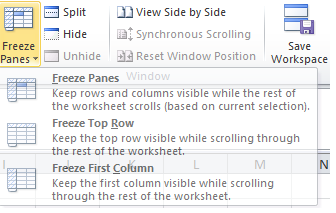
- Click on the View tab in the ribbon.
- Select Unfreeze Panes.
Simple Sort
Content in a table can be sorted alphabetically, numerically, and in many other ways. Sorting helps organize data by one or more columns in your table. Table 5.4 describes the different sort orders available for each column of data.
Table 5.4 Sort Options
| Sort Order | Text | Numbers | Dates |
| Ascending | Alphabetical (A-Z) | Smallest to Largest
Lowest to Highest |
Chronological (oldest to newest) |
| Descending | Reverse Alphabetical (Z-A) | Largest to Smallest
Highest to Lowest |
Reverse Chronological (newest to oldest) |
Let’s say we want to know what the snowiest day was in January in Portland, Maine; so we want to sort the Snow column in Descending order so that the snowiest day ends up at the top of the table.
- Click on the filter Click arrow to the right of the header Snow (inches) in the Portland ME worksheet.
- Click on the choice Click ZA↓ Sort Largest to Smallest. See Figure 5.8 below.
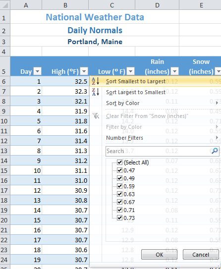
3. Now switch to the Portland Oregon sheet and repeat these sort steps to find the snowiest day in Oregon. Check your answers with Figure 5.10.
Skill Refresher
Sort a Column
- Click on the filter Click arrow to the right of the header in the column you want to sort.
- Click on the choice AZ! or ZA↓ to sort your data by that column.
Multi-level Sort
Sometimes you will need to sort your table by more than one column at a time in order to efficiently analyze your data. For example, if you were looking at several different types of loans from several bank offices, you would need to sort by the type of loan and then by bank office name to clearly see the different groups of loans. If you had a list of grades for students over their time in high school, you’d want to sort first by student name, but then also by grade level (freshman, sophomore, junior, and senior) so that each student’s grades would appear in chronological order.
For our weather data, let’s look at the snow days in Oregon and see how cold they were!
- Click on the Portland OR sheet, then click on a cell in the table.
- Click on the Data tab in the ribbon and then click the Sort button.
- Click the down-arrow for Column and select Snow (inches).
- Click the down-arrow for Order and select Largest to Smallest.
- To add 2nd level sort, click on the Add Level button in the top left corner of the dialog box.
- In the new Then by row, click the down-arrow for Column and select Low (°F).
- In the same row, click the down-arrow for Order and select Smallest to Largest. Your dialog box should look like Figure 5.11.
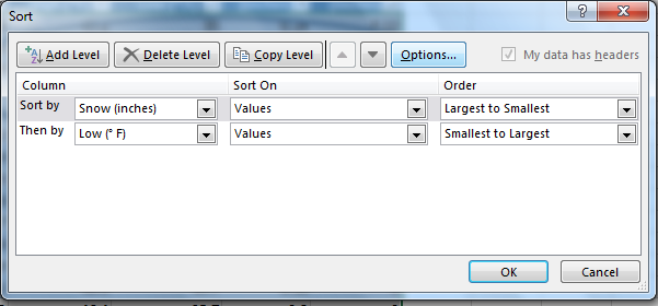
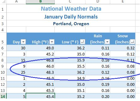
Figure 5.11 Multi-Level Sort - Click OK. Your table sort results should look like Figure 5.12. Notice for the two days with 0.08 inches of snow, the low temp of 35.5 on Day 9 is displayed before the low temp of 36.2 on Day 25. The lowest of the two was listed first. Also notice that the filter arrows changed on the sorted columns to show you how they are sorted.
Custom Sorts
In most cases, we want our data sorted in “typical” sort order: numbers sorted highest to lowest, words sorted alphabetically, etc. Some data in our everyday lives; however, does not make sense when sorted this way. For example, if you sorted the days of the week alphabetically, you’d get: Friday, Monday, Saturday, Sunday, Thursday, Tuesday, and Wednesday. This order would be of no use to anyone! Similarly, the months of the year would not make sense alphabetically. Can you think of a number that would not make sense in either highest to lowest or lowest to highest order? (This is a good brain teaser!)
In our weather data, we’ve added a column for the week in the Weekly OR sheet and changed the days to Sunday through Saturday. This sheet lets us further analyze Portland, Oregon’s data to see if there are weekly trends in the weather. Let’s see if we can sort the Weekly OR sheet by Week and then by Day.
- Click on the Weekly OR worksheet.
- Click on A5 and insert a table.
- Click on Sort in the Data tab in the ribbon.
- Click the down-arrow for Column and select Week.
- Click the down-arrow for Order and select Smallest to Largest.
- To add 2nd level sort, click on the Add Level button in the top right corner of the dialog box.
- In the new Then by row, click the down-arrow for Column and select Day.
- Click the down-arrow for Order and select Custom List. The dialog box in Figure 5.13 will appear on your screen.
- Click on Sunday, Monday, Tuesday, etc. in the Custom lists on the left-side of the dialog box. NOTE: Make sure you select the days of the week spelled out, not the abbreviations for the days of the week.
- Click OK. Your Sort dialog box should look like Figure 5.14.
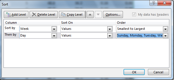
Figure 5.14 Sort Dialog Box - Click OK again. Your sorted table should now look like Figure 5.15. Notice the data is in Week order and, within each week, in Day order.
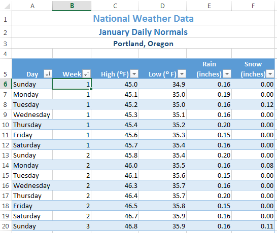
Figure 5.15 Custom Sort - Save your work.
Key Takeaways
- Tables are made up of adjacent rows and columns of data with a single row of column headings at the top.
- You can create a table by clicking in the top left-most cell in your data and selecting Table in the Insert tab of the ribbon.
- There are a gallery of styles, as well as, style options to choose from to format a table.
- When you need to add data, it is best to add it one row below the bottom of the table. You can then sort to reorganize your data.
- Freezing heading keeps your column headings displayed while you scroll through your table data.
- You can use the filter arrows in the table headings to sort by a single column. Use Sort in the Data tab in the ribbon to sort by two or more columns at a time.
- Custom Sorts can be used when data needs to be sorted in a special way (i.e. – Days of the Week).
Attribution
“5.1 Table Basics” by Diane Shingledecker, Portland Community College is licensed under CC BY 4.0
