
4.1.D: Choosing a Chart Type: Stacked Column Chart
Percent of Total: Stacked Column Chart
The last chart type we will demonstrate is the stacked column chart. We use a stacked column chart to show a percent of a total . For example, the data on the Enrollment Statistics worksheet shows student enrollment by race for several colleges. We would like to see all of the data on all of the colleges.
- Highlight the range A2:D6 on the Enrollment Statistics worksheet.
- Click the Insert tab of the ribbon.
- Click the Column button in the Charts group of commands. Select the 100% Stacked Column format option from 2-D Column section in the drop-down list (see Figure 4.22).
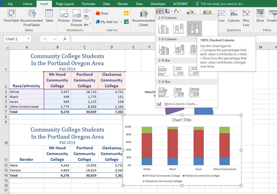
Figure 4.23 shows the column chart that is created after selecting the 100% Stacked Column format option. As mentioned, the goal of this chart is to show the enrollment of students by race. However, notice that Excel places the racial categories on the X axis. It would be more useful if the different colleges were there instead.
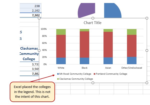
The reason that Excel organized the data this way is that there are more Race/ethnicity categories (data in column A) than there are colleges (data in row 2). Not a bad guess. But, not what we wanted in this case.
The remaining steps explain how to correct this problem and complete the chart:
- Click the Switch Row/Column button in the Design tab on the Chart Tools section of the ribbon. This reverses the legend and current X axis categories.
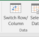
Figure 4.24 Switch Row/Column. - Click and drag the chart so the upper left corner is in the middle of cell E12.
- Resize the chart so the left side is locked to the left side of Column E, the right side is locked to the right side of Column N, the top is locked to the top of Row 12, and the bottom is locked to the bottom of Row 30.
- Click the legend one time and press the DELETE key on your keyboard.
- Add a Data Table. This is another way of displaying a legend for a column chart along with the numerical values that make up each component.
- In earlier versions of Excel, find the Labels group of commands and select the Show Data Table with Legend Keys option from the drop-down menu.
- In Excel 2016, find the Add Chart Element tool on the Design tab, select Data Table With Legend Keys
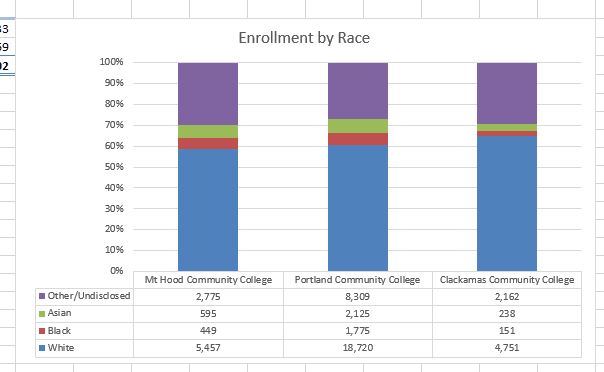
- Change the Chart Title to Enrollment by Race.
- If there is no chart title, you will need to add one using the Add Chart Element tool on the Design tab.
- Save your work.
Figure 4.25 shows the final stacked column chart. Notice the similarities and differences in the enrollment at the local community colleges.
Skill Refresher:
Inserting a Stacked Column Chart
- Highlight a range of cells that contain data that will be used to create the chart.
- Click the Insert tab of the ribbon.
- Click the Column button in the Charts group.
- Select the Stacked Column format option from the Column Chart drop-down menu to show the values of each category on the Y axis. Select the 100% Stacked Column option to show the percent of total for each category on the Y axis.
Attribution
Adapted by Noreen Brown from How to Use Microsoft Excel: The Careers in Practice Series, adapted by The Saylor Foundation without attribution as requested by the work’s original creator or licensee, and licensed under CC BY-NC-SA 3.0.
